
I accidentally discovered a technique while making this bookmark, which means that although the bookmark is imperfect (oh horrors!) I might be able to do some cool stuff in the future.
See, I covered part of the bookmark with clear embossing powder before stamping on it. You can't see the clear embossing in the picture, but you can clearly see the difference between the part of the stamp on the embossing and the part off of it.
The stamping on the embossed part looks really awesome and watery. It's perfect for the ship's reflection. (Reflections are great for reverse stamping -- I wanted it to be a bit broken up anyway!) It's less perfect on the ship itself.
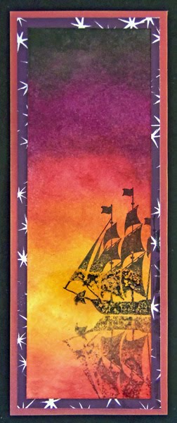
If I'd know this was going to happen, I would have put the ship right at the horizon, instead more towards us. Then only the reflection would have had the wateriness. Heck, maybe I would have put more sunset ink down in the water beforehand, because if I could get the wateriness there, it would be a gorgeous effect.
This was done with pigment ink, so I'm a little surprised it didn't just stick nicely on top of the embossing powder. This looks more like what I'd expect of a dye ink? I'm guessing the effect has to do not just with the glossiness of the embossing powder, but the texture -- except over the lower half of the sun, this was not a heavy coat, so it has a more up-and-down texture as individual grains spread and melted together but didn't form a uniform surface.
I definitely had to heat-set the ink here. Would that be unnecessary with something like a StazOn ink? Probably. Would I get the same effect with something like a StazOn ink? Well, if the glossiness is responsible, I probably wouldn't. But if it's mostly the texture, I probably would. This calls for more experimentation.
It's unlikely that this is some kind of breakthrough technique. If anyone knows of tutorials or technique posts about stamping on top of heat-embossed areas -- not resist techniques, but ones where the ink is supposed to stay on the embossed area -- please link them for me.
Has anyone noticed that sunset colors are pretty much fall colors? And that there are quite a few fall color based challenges hanging around? It's very poetic, since we might think of fall as the sunset of the year.
For example, look at DYSU's inspiration picture for this week's challenge "Warm Colors" and tell me it isn't just as sunset-y as autumnal:

It also strikes me that while this bookmark doesn't have anything to do with "sweaters" or "harvest", it does rather fit the "melancholy" word from the Loves Rubberstamps inspiration words:

(Of course, it also uses "red" and "yellow".)
I'm entering this bookmark in the following challenges:
- Do You Stack Up? #92: Warm Colors
- Pause Dream Enjoy #40: Purple & Orange (It's a reddish purple, but there's definitely a lot of purple and orange going on here.)
- Hiding in My Craft Room #66: Black, Orange, & Purple (plus a bit of red, I admit)
- Card Crafter's Circle #43: Autumn Colors (this is a bookmark, not a card, but the rules say tags etc. are okay so I think this fits)
- Loves Rubberstamps 20: All About Autumn (mainly using words "red" and "yellow", but also a bit of "melancholy". Uses Gourmet Rubber Stamps' Ship, which Loves Rubberstamps would still carry if I hadn't just bought it off them.)
- DL.ART Thankful Thursday: Halloween/fall colors or an owl or both (just fall colors)
- MilkCoffee: Welcome Fall (fall colors, fall as the sunset of the year)
- Little Miss Muffet 45: Simplicity (it's not one layer, but I think it fits as a CAS project)
- Crafty Mess 19: Anything Goes
Supplies:
This is just beautiful I love the technique and I also like the ship where it is.great job great colors
ReplyDeleteThank you for joining my DL.ART BCA/ANYTHING GOES Linky Party
DIANA L.
http://dianamlarson.blogspot.com
I meant to say My thankful Thursday challenge.
ReplyDeleteBut I do have another linky party going all month long, that you could enter also.
Have a great evening.
DIANA L.
http://dianamlarson.blogspot.com
Well, you don't have to tell me twice, I'll enter there too! The more links the merrier.
DeleteCool technique, love the colors and the fabulous design. Thanks for playing with us over at Loves Rubberstamps!!!
ReplyDeleteVery pretty card and great technique! Thanks for joining us over at Loves Rubberstamps! :) Marcy
ReplyDeleteI love bookmarks, and the colors are on this one are so vibrant! Thanks for playing at Pause Dream Enjoy. :) Janis
ReplyDeleteIsn't it great when we accidentally discover a new technique? And thanks for your comment on my blog. I like how you think. :D
ReplyDeleteWhat a fab inky creation, the colours are gorgeous :o) Hugs, Lisa x
ReplyDeleteGorgeous, thanks for joining us at Craftymess.
ReplyDeletelove them cols thanks for joying us at craftymess. xx
ReplyDeleteHello,
ReplyDeletegood techniq. I love colors. Thank you for joining us at Little Miss Muffet.
The Johnny Depp as Captain Jack Sparrow fan I am likes the ship image. Especially like the reflection. Thanks for entering Pause Dream Enjoy Purple & Orange Ch.
ReplyDeleteMelissa
"Sunshine HoneyBee"
PDE DT Group B
Gorgeous background. Thanks for joining PDE Challenge this week.
ReplyDeleteAwesome! Love the colors. Thanks for joining us at Do You Stack Up.
ReplyDelete-Wenche
Wow this is beautiful. I love the color blending. Thanks for sharing and joining us at HIMCR DT AJ!
ReplyDeleteWonderful scene and I like you idea to use the embossing powder to emphasise the reflection. Fabby.
ReplyDeletethanks for taking part in the Craftymess Challenge with us,
Ax
This is stunning. I love the design and the colours are wonderful
ReplyDeleteSue
Oh I love this - what a fab technique!
ReplyDeleteOh my goodness!! This is gorgeous!! I love everything about it! Thanks for joining us this week at HIMCR!
ReplyDeleteHiding in My Craft Room
~Laurie
Super bookmark and thanks for visiting my desk this week on WOYWW (I'm assuming you don't take part in it?) Anyway you are dead right about the shelf/desk scenario if I need something but often the bed comes in handy during the process! LOL BJ#24
ReplyDeleteBeautiful card.love the reflection of the ship.beautiful colors and stamping.Thanks for joining us at Milkcoffee stamps Welcome Fall challenge.
ReplyDeleteI love it! I can't wait to see what happens when you experiment with this technique more. I may just have to unearth my embossing powders and play too. Very cool! Thanks for playing along at Hiding in My Craft Room! ~Amber
ReplyDelete