Sunday, September 30, 2012

(The RNG at) Robyn's Fetish Challenge likes Frog Princess!

RNG stands for Random Number Generator -- the top picks at Robyn's are picked randomly, you see, not by a person or people. And in Robyn's "Book Marks" challenge, it picked one of my bookmarks.

But the RNG did not pick Rainbow Pennants or Cold Outside, which I also submitted. It liked Frog Princess, possibly the pinkest thing I've ever done.

To be quite honest, and rather to my own surprise given the pinkness, Frog Princess is my favorite of those I submitted. So I'm glad the RNG chose it instead of one of the others.

It actually had to choose at least one -- there is one winner and three top picks, and I was three out of the seven entries. Look, the challenge was "Book Marks", okay, do you expect me not to max out my entry quota?

Bookmarks XXXV: Pressed Flowers

I'm really happy with the background I made for this bookmark, and I like it overall. But I'm pretty sure this vintage-y lace-y stuff is not my strength.

Partly because now I have to remember to hide the ribbon and lace ribbon from my cat, who loves to eat it. Not only is that bad for the ribbon, it's pretty bad for the cat.

For this vintage-y lace-y thing, I took my main inspiration from two different photo inspiration challenges: Loves Rubberstamps and Stampalot. I'm not actually entering the Stampalot challenge, because I'm a bit late for it, but it seemed only fair to show the inspiration photo anyway.

Loves Rubberstamps Pintrest Photo Inspiration Challenge Stampalot September Inspiration Challenge

Lace-flowers-vintage was the message I got from both photos.

Now, most of my inks are pigment inks. Last night I stamped myself a floral background on a white base, sometimes stamping twice without re-inking for a faded look. I was also determined to color-distress the edges. With pigment inks. And I don't actually have any brown inks that aren't really dark chocolate-y chestnut-y brown.

The closest I do have to light brown is the Amber Satin in my Silks 'n' Satins Colorbox Queue. It's sort of a metallic taupe. I know, distressing with a metallic pigment ink? It's not ideal. But I tried it and I think it worked out okay.

I did go out this morning and get some Tea Dye Distress ink. If that's what Tim Holtz thinks things dyed with tea looks like, he maybe ought try tea-dying again, because this is way too dark and way too red-orange. I mean, sure, I can dye things pink with tea, but that is because I drink herbal strawberry tea, which involves no actual tea leaves.

Actual black tea does not dye an orangeish color and it's usually not this dark. I wanted neither dark nor orange for this project -- although I did use it to color a bit of white ribbon, and that turned out to be a color I could use. I didn't like it for edging.

I think maybe dye inks just aren't for me? I guess I should give the Antique Linen and Old Paper colors a try before I completely give up on a product designed to do exactly what I'm trying to do with it. Sheesh, I'm glad I didn't try Vintage Photo, that stuff's even darker than Tea Dye. Am I using it wrong? Edging doesn't seem like a technique that's easy to mess up.

Where was I? Oh, yes, so then I tone-on-tone stamped a couple of small pieces of paper with the same flowers as the background -- you can't see it in the photo and can hardly see it in real life, but at least it adds some texture -- and edged them too. With Amber Silk. I stamped myself a little button, backed it on another piece of cardboard, pierced it, threaded the Tea Dye'd ribbon through and tied it in a bow. I couldn't make myself use a real button; it would be too hard to shut a book on it. As it is I have my doubts about the knot of the bow.

I used this week's sketch (#72) from Papertake Weekly, turning it on its side and doing away with one of the matting layers. My button isn't exactly text, but it's the right shape...

Papertake Weekly Sketch #72

I had a sort of empty space left on the middle paper layer, so I punched a little flower using my corner punch, cut around it, and colored it with more of the red-purples from the Silks 'n' Satins queue. I don't know that it quite fits the rest of the bookmark, but it's a flower in the right colors, so close enough.

(It's not backed on black, that's just the photo background.)

I'm entering this bookmark in the following challenges:

I'm also linking it up to DL.ART's 1000-post Linky Party.

Supplies: (ribbon is Spool o' Ribbon white 1/8" by Offray, and lace is Celebrate It Occasions (i.e. Michaels) white 7/8")

Saturday, September 29, 2012

Bookmarks XXXIV: All Hallows Eve

I gotta keep better track of challenge rules. Three of the challenges that went into the design of this bookmark, I can't submit to because they have a low limit on the number of combined challenges. Normally, I note this down and plan around it. This time I did not.

To skip me rambling on about challenges I didn't even enter, you can click here to jump straight to the project picture and the challenges I did enter.

The first challenge that I used but won't be entering is Touch Twin Color Challenge #26, from which the color inspiration mainly came.

Touch Twin only allows five combined challenges. I like the color combination a lot, and the challenge doesn't end for a little less than a week, so I'll make something else to submit there.

The second challenge that I designed for but won't submit to is Frilly and Funkie: Fall into Fall, which asks us to use fall colors and also, of course, to be vintage-y in either a frilly or a "funkie" way. I don't know that I actually succeeded in making something they would consider "funkie", but I sure gave it a shot, smooshing colors around and attacking edges with my craft knife and generally stamping things over other things and all. I spritzed things on already-inked-up stamps and rubbed paper around in the pretty mess left on my craft sheet! I did not adhere odd bits of metal, but this is a bookmark, not a tag, and it has to fit in a closed book.

Frilly and Funkie allows only four combined challenges. As their rules quite reasonably explain, "We are hoping that you will make a card for our challenge, not use our challenge to fit a card that you have already made." What makes me sad is that I did make a project for their challenge: it was one of my primary motivators -- it just also happens to work for a bunch of other challenges that don't mind more combinations. (Shockingly, as it is fall in the northern hemisphere, lots of challenges involve fall colors right now.)

The third challenge that I incorporated but won't be submitting to is Tando Creative: Leaves and or Trees. I wanted to put a bare-branched tree in front of my moon, but that just didn't work out. In the end I resorted to stamping a leaf stamp a bunch of times on the bottom of the bookmark in several fall colors. It looks really neat, but you can't see it in the photo very well.

Tando Creative allows only five combined challenges. To be quite fair, this was a challenge that I was trying to fit in just because I could, so in this case the combination limit has served its purpose. Since the challenge ends in fewer than 24 hours I doubt I'll be making something else to submit. Oh well.

I do want to repeat that I do understand why these limits exist. They may not be the perfect solution if you don't want scattershot entries in your contest, but they are a nice clear easy-to-implement one, and that counts for a great deal. My complaints here are really a result of poor record-keeping on my part, and shouldn't reflect negatively on the challenges themselves.

Of course I just could have submitted it to these three challenges + the sketch challenge I used, but since part of the fun for me is combining as many challenges as I can, I decided not to.

I ended up making a sort of Halloween/Fall bookmark: colors mainly in red, purple, and gold, with a Halloween moon in the night sky and a bat sweeping through some branches. Once I thought of the moon I knew exactly which sketch I was going to use, too, because this week's Tuesday Morning Sketch (#165) has a great big round element in it.

And it is so beautifully bookmark-adaptable! I did not even have to flip it. The big circular element became the moon, of course. The banners became black branch silhouettes, and the collections of embellishments became a bat.

I am entering this bookmark in the following challenges:

I'm also linking it up to DL.ART's 1000-post Linky Party.

Supplies:

Emergency Crafters likes Rainbow Pennants!

My Rainbow Pennants bookmark won third place in Emergency Crafters' "Somewhere Over the Rainbow" challenge!

It took me a while to remember that the emergency number in Britain is 999, not 911 as it is in the States. Then the badge made sense. Unfortunately the type on the badge is a little small (especially once I shrunk the badge to fit in my sidebar), but it says "THIRD PLACE!!" and has the link to Emergency Crafters.

Friday, September 28, 2012

Save Lids To Save Lives

I made a not-bookmark thing! I haven't been able to think of what to make for the various Breast Cancer Awareness/Think Pink challenges going on this month, you see. I mean, eventually I did think pink and submitted that, but it seemed a little wrong not to do something for BCA too.

I thought maybe I'd make a thing to hang in the shower to remind me to do self-exams. That is, I could make a thing that looked very much like a bookmark, laminate it, and call it good. (I debated what it should say. Possibilities included "Feel Yourself Up" and "Check Yourself Before You Wreck Yourself".)

In trying to think about that, I thought I might use some of the yoghurt lids around here -- I don't have any ribbons, real or stampy, but the lids do because they're part of Yoplait's Save Lids to Save Lives program.

Then I thought, wait, it seems a shame to sacrifice something that's actually useful just because you're sad you can't find any ribbon stamps. Because we do eat significant quantities of yoghurt, and we do save the lids and send them in. Usually they collect on top of the microwave. If we're particularly neat and fussy they might end up in a ziplock bag, still on top of the microwave.

I had a brainwave. I could make something to keep them in, make them easily countable, and contain the mess! Visions of tiny envelopes full of yoghurt lids danced in my head.

At this point I've got a fairly good idea of what's sitting about in the local big box craft stores, and tiny envelopes haven't come to my attention lately. I briefly contemplated making them. Then I contemplated it some more. I decided that was definitely a backup plan.

So I went to Staples. I not only found tiny envelopes, I found a bright pink index card holder to put them in! Normally I am not very into bright pink (or pale pink, for that matter), but it was clearly perfect for this project.

The ideal envelopes would be a bit shorter and squatter, but compared to making a bunch, me and my achy shoulder will take no. 1 coin envelopes every day of the week.

I determined that I could probably stuff five or so lids into an envelope without becoming frustrated. It would be neater if they held 10 apiece -- since each lid represents 10 cents, an envelope would be $1 -- but they are what they are. So two envelopes are $1. I determined to stamp the number 5 on each envelope, a little bit to remind my future self what I was supposed to do... but mostly because by gosh I was going to stamp something.

I tried three pinks, all heat embossed with sparkly embossing powder, and settled on the brightest one. It goes best with the index card holder and with the lids themselves.

Since it's not terribly important what the envelopes look like, I kept all three and did 17 more in the bright pink, for a total of twenty. (Stamping and embossing 17 more was pretty easy; since this is pigment ink, and dries slowly, I did a couple of batches of stamp-then-emboss rather than doing them one at a time.) The envelopes are a bit loose in the holder right now, but I think once they're stuffed with lids they will be packed tight.

That paper blank clearly needed something on it. I choose to write out the address we'll be sending the lids to -- that way we won't have to squint at a lid when the time comes. I decorated the corners with little pink ribbons, hand-drawn. I have some confidence that, given the context, they will probably not be mistaken for stylized fish.

I popped the card back into its pocket. I like it there; now the holder is more than an anonymous pink thing.

To finish things off, I wrote out "Save Lids to Save Lives" again on a white strip of cardstock and taped it to the spine of the holder. (You can see I did not succeed in stopping my handwriting from getting smaller as I wrote. Oh well.)

And that's my BCA/Think Pink project -- it's pink and it holds lids that will eventually be sent off so that Yoplait donates a couple more dollars to the Susan B. Komen foundation. If we fill it, it will only be $10, but it would be easy to send away the little envelopes and stamp more to start collecting another $10 of lids. Probably the fanciest thing about it is the glittery embossing powder -- it's not the epitome of amazing papercraft projects by any means -- but it will serve a useful purpose.

Probably on top of the microwave.

I'm entering this little project in the following challenges:

Undisclaimer: I'm not being paid or sponsored or anything like that by Yoplait. Alas.

Supplies: (envelopes and index card case are from Staples, which is just very unfriendly to the linking widget)

Thursday, September 27, 2012

Bookmarks XXXIII: Cold Outside

Why is it that I can weave jillions of technique, color, and material challenges together without much of a problem, but I always hit a snag with adding a dang sentiment? It can't really be this hard!

Well, I guess it can be legitimately difficult when I am making a Christmas-y/winter-y bookmark and I have no such sentiments.

I stamped -- and paper-pieced, a first for me -- a cute set of mittens for the bookmark, so I wanted a sentiment to go with them and sort of shade the whole creation towards the Christmas-y side of winter-y. Obviously there's nothing specific to Christmas about a pair of mittens, especially for folks in the southern hemisphere!

And that is why I have been singing Christmas carols all evening, ones about the cold. In the end I had a bit of a hard time deciding between "Baby, It's Cold Outside" and "Let It Snow" (from which I was going to use the phrase "all the way home I'll be warm"). On the one hand, four words are a lot easier to squeeze in than six. On the other hand, have you ever really listened to the lyrics for "Baby, It's Cold Outside"? It's actually kinda creepy. Hey there, dude, spiking your lady's drink to get her to stay is not cool.

Regardless, aesthetics won out and that's the sentiment I ended up using, but please understand that on my bookmark it means "so put on some mittens", and not anything else.

Listening to the meaning of lyrics is awful and I recommend you never do it.

Anyway, I spent about an hour writing this silly four-word phrase out -- in pen, in embossing pen and powder, on strips of washi tape, in capitals, in lowercase, in seventy-odd combinations of the above... and finally I realized that not ten feet away was a computer with a color printer and the ability to download fonts. This one's called "Frosty", and is by Ben Balvanz of Font-a-licious. It's licensed for personal use, just like most stamp images are -- although I doubt it has any kind of angel policy.

All of the shiny metal is silver, but there was this light, and it was yellow, see, so a bunch of it looks gold. Which is kinda cool, but not an accurate representation of the project.

Christmas Challenges asks that people do not post their sketches (even to credit them, I guess?), but instead link to the relevant post. So there you are; some challenges absolutely require you post their inspiration pics, and some absolutely require that you not do so. Both approaches make a certain amount of sense.

I'm entering this bookmark in the following challenges:

I'm also linking it up to DL.ART's 1000-post Linky Party.

Supplies:

Wednesday, September 26, 2012

Bookmarks XXXII: Frog Princess

The frog princess has a golden ball just like the human princess, but when it falls into the well she just goes in right after it.

Once she managed to lose the golden ball up in a tree. A human prince happened to be sitting under the tree, so she asked him to get it down for her. When he proceeded to demand to eat off her plate, and sleep on her pillow, and all that rigamarole, she simply called on the frog gardeners and had them get it down instead.

She's both independent and charming, and she knows it. That's why she looks so self-satisfied. That and the being-a-princess, which does tend to give one an over-inflated idea of one's self-importance.

I shall put this bookmark into "The Ordinary Princess" by M. M. Kaye. Princess Amy is not a frog, but she is certainly both independent and charming.

I'm entering this bookmark into these challenges:

I'm also linking it up to DL.ART's 1000-post Linky Party and Unique Crafters' Big Chance Giveaway.

Supplies: (white 110lb. cardstock is from Staples)

Bookmarks XXXI: Scare Up Some Fun

I have to admit Lawnscaping challenges are a bit frustrating for me. Because gosh darn it, I want to enter more than three challenges with one project! So many Anything Goes challenges are deprived of the fruit of my genius efforts! (I'm sure they're heartbroken.)

But I love Lawn Fawn and I love the aesthetic sense of the whole Lawnscaping design team, and I can't let it go by without an entry. And it does make writing up the challenge listing a lot easier, so there's that.

This week's challenge was to add text -- use a sentiment or patterned paper. So I used both.

For my patterned paper I used one with a bunch of stereotypical cat names on it. This paper has a bit of a distressed look -- so the solid cardstock colors I used looked a little too, well, solid. Since the colorful kitty names are mostly streaked with red on the patterned paper, I smushed my finger into a red ink pad and rubbed it on. They ended up with a similar streaky look, just as I was hoping! (I didn't rub it on the whole of the greenish base, but used my mostly-dried finger to add just a little to the area around the sentiment.)

I only own one set of Lawn Fawn stamps (although another should be in the mail soon!), and no Wags 'n Whiskers stamps, and no Creative Inspirations paint, so I hope the design teams are not too saddened when they see absolutely none of those things on my bookmark.

I'm entering this bookmark in the following challenges:

I'm also linking it up to DL.ART's 1000-post Linky Party and Unique Crafters' Big Chance Giveaway.

Supplies:

Tuesday, September 25, 2012

Bookmarks XXX (30): Rainbow Pennants

I've been a bit worried about this bookmark. Even when I didn't know what it would be, or when I would make it, I worried. Because this is the 30th bookmark, and I am numbering them with Roman numerals... and XXX doesn't always mean 30 in our modern world.

This bookmark is so family-safe it doesn't even have any images on it! Just triangles! I guess if you have serious issues with triangles that aren't quite isosceles it could be annoying to look at, but that's the most danger your eyes will encounter here.

This bookmark came together very simply based mainly on two challenges: Emergency Crafters' "Somewhere over the Rainbow" and Frosted Designs' "Triangles!". Apparently I wasn't feeling terribly interpretive, because I made some triangles in rainbow colors.

I don't have all the nice bright primary/secondary learned-'em-in-kindergarten colors of paper, but I do have them in embossing powder. So I made my triangles by free-hand-cutting some white cardstock, took an embossing pen to them, and used the embossing powder to create color.

I am glad I decided not to try to get perfect coverage with the embossing pen. The advantage of an embossing pen is that as long as you keep re-inking the paper and re-sprinkling the powder and hitting it with the heat gun, you can eventually achieve full coverage no matter what your level of heat embossing proficiency. But by choosing not to try for perfect, but to leave my embossing deliberately streaky, I saved a lot of time and created a bit of an interesting effect. The rest of the bookmark is so simple that solid blocks of color might not have worked as well as my imperfect ones.

I couldn't decide whether my triangles ought to go on black or on white. So I put them on a nice pearlescent grey and called it good.

I'm entering this bookmark in the following challenges:

Supplies: (white 110lb. cardstock is from Staples)

(Edited 9-26-12 to add supplies list.)

Loves Rubberstamps likes Circles Circles Circles!

Likelihood that I will be posting self-congratulatory posts all week: very low. But today I found something very sweet in my blog feed: because so few people participated in the Espresso, Pumpkin, & Aqua color challenge at Loves Rubberstamps, and they liked all our projects, Laura Love is very kindly giving a $5 gift certificate to each of us (all four of us!) who did not win the random draw. She posted all of our projects and declared every one of us to be favorites for the week.

See, my favorite project would have been the lovely card with snowmen on it, by Annie Rose, but over at Loves Rubberstamps they are more generous than that.

This week's challenge is a photo inspiration challenge, and you should check it out, because Loves Rubberstamps is good people.

Monday, September 24, 2012

Incy Wincy likes Wintergreen!

There was an awesome birthday present in my blog feed this morning: my Wintergreen bookmark is in the top three at Incy Wincy for their Monochromatic Green challenge!

I have no idea what the papercraft blog etiquette is regarding posting about things like this, but for now I don't care. It might not be the most beautiful badge in the world. There might have been only 16 contestants. But gosh darn it it's the first badge I've ever gotten.

Also, it's my birthday, and I can make self-congratulatory posts if I want to.

Sunday, September 23, 2012

Bookmarks XXIX: Monarch Migration

In the later weeks of September, if you are very lucky, you may see a Monarch elephant on its lonely migration, south to Mexico for the winter.

Another day, another color challenge involving orange. But this time it was in a nice easy fall-ish combination: Flamingo, Honey, and Coffee.

And another color challenge means another color test! I settled on Terra Cotta, Ochre, and Chestnut, although in the final project I only really used them for edging. It's better than not using them at all!

Every time I looked at this color prompt, my eye was drawn to the little flying elephant/pig thing in the lower right. I know it's only there for the background color, but... flying elephant! I have an elephant stamp. I have plenty of butterfly stamps to steal from wings from. I had to make a flying elephant, and with these lovely fall colors, I decided it was a Monarch elephant, migrating south for the winter like Monarch butterflies do. It's so big, though, that I think it must migrate in a solitary fashion.

If I'd thought of the monarch thing before stamping and embossing the wings, I probably would have tried to make them look a bit like a monarch butterfly's wings. Considering I stamped and embossed just the elephant about five times until I was happy with it, it is probably a good thing that I was only aiming for white wings and not something more complicated.

I put my elephant on this nice simple sketch from this week's challenge at Skipping Stones Design:

I hand-cut the central element without doing a lot of calculation or drawing out first, so it is either whimsical or wince-inducing depending on your preferences. Since I don't have any sort of die-cutting machine, it wasn't going to be perfect anyway -- therefore it might as well be imperfect enough that you can tell the imperfection was probably on purpose!

Here's my migrating elephant:

I allowed myself a little bit of dimensionality with the wings. Now, a bookmark still must be flat to be functional, so I didn't pop the near wing up on dimensional adhesive or anything. But it isn't glued on all the way, either, just attached at the base with a little tab -- that way it squishes flat inside a book but you can flap it about outside a book.

I'm entering this bookmark in the following challenges:

I'm also linking it up to DL.ART's 1000-post Linky Party and Unique Crafters' Big Chance Giveaway.

Supplies: (light orange paper with little acorns is from DCWV's Autumn Melody matstack, which I cannot find online to link to)

Saturday, September 22, 2012

Bookmarks XXVIII: Wintergreen

I'm pretty pleased with how the sparkly embossing powder worked on that Christmas tree.

On the other hand, I wish I'd had some teeny little presents at the same scale as the tree; that would have made a neat little scene. I should have just used some little squares of paper, but I keep forgetting that there are ways to make images that don't involve a stamp. Hopefully I'll remember that for the next time I use this tree.

I do like the background of the bookmark, though. I had fun weaving the washi tape and paper strips together, although you can really only see the effect once. It looks like a really fancy kind of thing you could do to put ribbons around a present.

I probably should have fussy cut the present, or paper pieced it or something. I'm a little sad about how much it disappears into its background and matting. Oh well, can't win 'em all, and the tree turned out really well.

I am entering this bookmark into the following challenges:

Supplies: (white 110lb. cardstock is from Staples, washi tape from Recollections/Michaels, and the middle-size green oval was cut from the packaging of the Christmas tree stamp.)

Friday, September 21, 2012

Bookmarks XXVII: Acorn & Oak Leaf

I am far too sleepy for it to be this early on Friday night, so this is going to be quick rather than ramble-y. I'm fairly sure I haven't used any fantastic new techniques here, but feel free to ask in the comments if you want to know how I did something.

And lo, there was an autumnal bookmark, and it was layered shimmery taped distressed heat embossed good.

I'm entering this bookmark into these challenges:

Supplies: (patterned paper is from DCWV's Autumn Melody matstack, washi or "crafting" tape is from Recollections/Michaels, and the stamps are from an Inkadinkado mini-set. I can't find any product listings for these online, so they're not in the widget.)

Bookmarks XXVI: Imperial Rabbit

Imperial purple, a.k.a. Tyrian red, is actually much more red than any of the purples I've used. In this case, a snappy name won out over historical accuracy.

There's a lot of rambling today, so if you like you can click here and skip straight to the final project picture and the challenge listings.

Or maybe the bunny actually is an empress or emperor. I don't know much about the governmental system of rubber stamps.

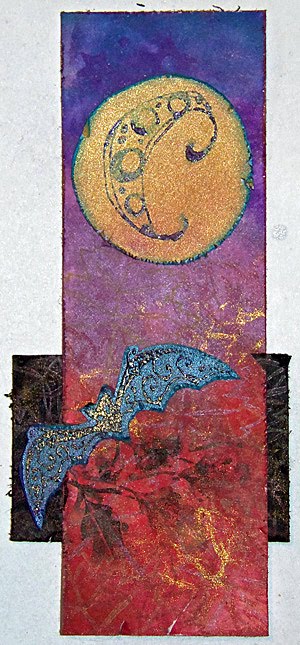
I've really been abusing my shoulder lately -- too much time using a mouse without good posture and too much time cutting around stamped images. So today I had two resolutions: sit up straight at the computer, and don't make any cuts that aren't long straight lines. This week's sketch from Sketch N Stash seemed perfect: lots of visual interest, probably adaptable to bookmark form, and all rectangles.

Of course, using the sketch is only half the challenge at Sketch N Stash. You also have to use some new or neglected stash items. Fortunately, that played into a couple of other challenges.

Color-wise, I chose to use purple. First, I have several colors of plain purple cardstock that I've not used at all since I bought the pack they're in. Second, purple meets two challenges: Allsorts's "Purple Passion" and The Crafty Bloggers Network's "Purple".

This also means you have to look at another one of my color tests, because a)I still haven't made a reference sheet and b)these mice from October Afternoon are great stuff and deserve to be seen.

You can see I was testing on the index card I used to record the information about the challenge at The Crafty Bloggers Network. And doesn't that rabbit stamp off beautifully? I inked it once for the actual image I used on the project and stamped it off repeatedly on this index card. I love how even the image is, no matter how light it gets! Is this maybe because it is such a solid stamp, and not a line-drawing type image?

The other challenge I had in mind for using neglected stash was My Craft Spot's challenge to use a wild animal. You have no idea how many unused animal stamps I have, and quite a few of them aren't even cats.

I just really like cats, okay? I should do some kind of use-all-the-cat-stamps collage, except I'm afraid then I would learn how many cat stamps I actually have, and then I wouldn't ever be able to get any more. I'm sure most of us have some growing collection like this -- if you don't, please don't tell me so, as I like this illusion.

Anyway, my first thought was to use the absolutely charming raccoon from October Afternoon's Woodland Park stamps. That raccoon was what tipped me over the line between "okay, that goes on my wishlist" and "take my money" for that set, and I still haven't actually used it. But when looking back at the design team samples for My Craft Spot, I realized that GiGi of The Cricut Bug had submitted... a purple card featuring a raccoon. (It's cute, go check it out.) Not the same raccoon, but still.

Needless to say, rather than submit something so very similar but not actually inspired by someone else's work, I decided the raccoon would have to wait for another project. Great minds think alike, I guess?

It's not like there aren't plenty of other wonderful stamps in that set that I also haven't used yet. I chose the larger rabbit. (I had already used the smaller one on one of the Popsicles in the Park bookmarks.) In retrospect, the rabbit is a better choice than the raccoon anyway, both for the sketch and for the bookmark form: the rabbit is taller than it is wide, whereas the raccoon is exactly the opposite.

I also grabbed the purple cardstock I mentioned. Now, these two purples are lovely and bright, but the third purple I wanted to use is very greyish purple -- despite coming from a pack marked "Brights". Then I went and sprayed it with pewter (previously unused!) and silver Shimmer Spritz, which didn't exactly make it a brighter purple, just more sparkly. I'm not sure what I was thinking there.

Edging all the pieces of cardstock saved me. The white cardstock, for example, looked horrible before I edged it in pewter. Then I matted it too, which didn't hurt.

Tip: Papers that just won't go together no matter how much you wish they did? Try edging one in a color that goes with the other. (Or edge both!) The amount of color in the edging won't be enough to go badly with the paper it's on, but it will be enough to make the transition between the two papers work.

So with everything edged and heat-set -- I only really own pigment ink, but decided to take a bit of a break from the embossing powder after yesterday's rather messy effort -- I began construction. At which point I accidentally got a shimmery fingerprint and a smear of glue on my nice pristine white focal point. True, it wouldn't have been that hard to re-stamp, but I wanted to be done! So I went with it.

Tip: Oh no, your clean surface got smudged! I'm sure you meant to go for the distressed look all along, though, right? So rub your fingers around in whatever caused the smudge in the first place and go to town! One smudge is clumsy. Lots of smudging is technique.

C'mon, you know your project needs some shimmery fingerprints too.

I did have some trouble with the criss-cross elements in the sketch; nothing I tried seemed to work, so I left them out. Of course, now I remember that I actually own many many colors of embroidery floss, which might have looked nice. Oh well.

I'm entering this bookmark into the following challenges:

I'm also linking it up to DL.ART's 1000-post Linky Party.

Supplies: (white 110lb. cardstock is from Staples, but the widget doesn't like the picture Staples has)

Thursday, September 20, 2012

Bookmarks XXV: Wish Dragon

Last weekend a friend of mine came over to do some crafting. As she was looking through my stack of bookmarks, she saw that I had been using Lawn Fawn's Critters Ever After pretty heavily: dragons, dragons & unicorns, griffins, even the frog. She told me I couldn't use that set any more. And she loves dragons!

To be fair, she may have also found the rest of the background paper I made with the dragon and unicorn (for Backgrounds Ever After), and that's a lot of dragon and unicorn to come across as you're rummaging through the paper box.

So when I saw this week's challenge at Totally Papercrafts was to "use your favorite stamp", I figured that the dragon was a pretty good choice. I'm not really sure what stamp is my favorite, but the evidence suggests this one ranks pretty high!

A few other challenges in my stack suggested elegance: Cupcake Craft's Script and Gold challenge and, of course, this week's CAS-ual Friday challenge, Black and White Plus One. Black and white and gold with some script sounds pretty elegant, right?

Well, I think the design of the bookmark did okay at elegant, but I'm afraid the implementation did not live up to it. "Look at all my stray embossing powder" is not elegant. Oh well, at least the dragon is looking good.

I have got to stop giving in to the urge to cut around stamped images. My poor shoulder needs a break.

I'm entering this bookmarks in these challenges:

Supplies: (white 110lb. cardstock is from Staples, which has no picture that the linky widget will accept)