Showing posts with label lovesrubberstamps. Show all posts

Monday, January 7, 2013

Plaid Paper Person

I just had to use the dies my mother gave me for Christmas on my thank you card for her. And I thought it was pretty appropriate that I use some of my first playing-around-with-paper-to-hand cuts, too: I only cut a new body for this card. I wanted a sort of neutral person-color, so I chose kraft paper.

My little figure looked cute and cozy on the front of the card, but very alone. So I turned to my tapes and picked out this bronze-y diagonal plaid -- I think it goes pretty well with the colors, and works okay with the plaid of the hat and scarf. It helps the card look less kindergarten-project-y.

I tried stamping my sentiment directly on the red with a vaguely kraft-colored ink, but it just didn't show up. Then I covered that effort with the blue circle and tried again... it still doesn't show up very well, but at least it's visible!

I'm entering this plaid-decked card in the following challenges:

Supplies: (tape is by Recollections/Michaels)

Sunday, January 6, 2013

Cheery Cherry Snowman

My sister got me a little pot in cheerful red for Christmas, so for her I made a thank-you card in cheerful red. Hey, you gotta find inspiration where you can.

So I stamped a snowman and a sentiment on it, and it looked pretty much finished. But it also looked very plain, so I stuck some strips of patterned paper on the inside and the outside. One Christmas-y thank-you card, complete.

I'm entering this simple card in the following challenges:

I'm also linking up with DL.ART's Thankful Thursday January Linky Party.

Supplies: (the 'thank you' stamp was a gift with an order from Lawn Fawn)

Saturday, January 5, 2013

Scarfy Sledding

Wheee! When I was looking for wintery images for my Christmas thank-you cards, this little Lawn Fawn bunny was an obvious choice -- especially since I hadn't used it yet! Then I went looking for something wintery to back it on, which didn't go well until I remembered that Anya had bought a whole darn pack of snowy paper only a few weeks ago. My memory, it's not always so great.

Well, I not only found a nice snowy background, but one that looked like snowy hills -- perfect for the sledding bunny. Hurrah for Anya's paper!

Then I found some plaid paper and paper pieced the bunny's scarf. Hey, it looked great the seventy-five times I saw other people do it with this stamp... and it looks pretty great here too, I think. I cut the front side of the card down so that the scarf could fly free but would still be protected in the envelope, an idea which I picked up from the card Jennifer McGuire created recently showing off one of the 2013 Hero Arts stamps.

I definitely picked a matching color to stamp my "thank you" in, but maybe I should have gone for something a bit darker and more visible! Well, they're the only words on there, so I don't think they're going to be missed.

I'm entering this wintery card in the following challenges:

I'm also linking up with DL.ART's Thankful Thursday January Linky Party -- it's anything goes, but (again) a thank-you card seems quite appropriate!

Supplies: (the "thank you" stamp is a freebie from Lawn Fawn)

Friday, January 4, 2013

Tropically Krafty

A few of my aunts and uncles recently got together and got me a nice gift card, so I made them some thank-you cards. I wasn't really sure what to do until I decided to be inspired by the card they sent along with the gift card. The card was brown, with a debossed gold vine and some white flowers with dark pink centers. I skipped the vine and used much bigger flowers.

I made an attempt at stamping the flowers in dark pink and using white embossing powder just around their edges, so as to have a dark pink center. Unsurprisingly, the embossing powder stuck to everything, and my flowers were plain white. Bah. So I took my finger, smooshed it in the pink ink pad, and dabbed at the centers -- and it turns out I really like the effect!

Thank goodness for serendipity. Whatever would I do without it?

I'm entering this serendipitous card in the following challenges:

I'm also linking up with DL.ART's Thankful Thursday January Linky Party -- it's anything goes, but thank-you cards seem very appropriate!

Supplies:

Sunday, December 9, 2012

Bluebird of Winter

Well, anyway, the bird is blue, even if it's not a bluebird. And the birdhouse is pretty wintery!

For this birdhouse, I decorated with stamping rather than with scraps. Metallic blue snowflakes in various stages of stamping off decorate the white roof; I stamped the cute little bird on the front, and a snowman on the back:

I'm entering this snowy birdhouse in the following challenges:

Friday, December 7, 2012

Bookmarks LV: Cinnamon Steam

I find that when my friend comes over to make bookmarks with me, I often end up making things out of her scraps. And they're things I'm really quite pleased with -- simple and not over-thought.

In this case, she was using a steam-patterned paper as a background for a dragon, and I trimmed the paper down around her stamping, leaving me with a few long skinny strips. Now, I don't have any long skinny dragon stamps (note to self: fix this), but I do have a teapot and a cup of tea with a wisp of steam coming out.

"What this scrap needs," I announced, "is tea."

So I stamped the teacup, went at the edges with ink and then with wet fingers, and when it was dry I glued the strip down on some nice pearlized paper... which was also a scrap from my friend's bookmark. Hey, if someone else is going to do the color-matching for me, I'm not going to complain!

(She also figured out what to put in the empty space... I think at least half the design credit here has to go to her!)

I'm entering this steamy bookmark into the following challenges:

Supplies:

Thursday, December 6, 2012

Bookmarks LIV: Green Swirlies

This bookmark wasn't even my idea. My friend was going through my matstacks and said "This paper is so pretty! You could just cut off this side and it would be a pretty bookmark all by itself."

So I did.

Well, I couldn't resist backing the strip on something else and doing a little bit of stamping here, but the paper is really doing most of the work. It was quick and easy and it looks nice: how much more can I ask for?

I'm entering this bookmark into the following challenges:

Supplies:

Saturday, October 6, 2012

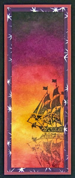
Bookmarks XXXVI: To Sail Beyond the Sunset

I accidentally discovered a technique while making this bookmark, which means that although the bookmark is imperfect (oh horrors!) I might be able to do some cool stuff in the future.

See, I covered part of the bookmark with clear embossing powder before stamping on it. You can't see the clear embossing in the picture, but you can clearly see the difference between the part of the stamp on the embossing and the part off of it.

The stamping on the embossed part looks really awesome and watery. It's perfect for the ship's reflection. (Reflections are great for reverse stamping -- I wanted it to be a bit broken up anyway!) It's less perfect on the ship itself.

If I'd know this was going to happen, I would have put the ship right at the horizon, instead more towards us. Then only the reflection would have had the wateriness. Heck, maybe I would have put more sunset ink down in the water beforehand, because if I could get the wateriness there, it would be a gorgeous effect.

This was done with pigment ink, so I'm a little surprised it didn't just stick nicely on top of the embossing powder. This looks more like what I'd expect of a dye ink? I'm guessing the effect has to do not just with the glossiness of the embossing powder, but the texture -- except over the lower half of the sun, this was not a heavy coat, so it has a more up-and-down texture as individual grains spread and melted together but didn't form a uniform surface.

I definitely had to heat-set the ink here. Would that be unnecessary with something like a StazOn ink? Probably. Would I get the same effect with something like a StazOn ink? Well, if the glossiness is responsible, I probably wouldn't. But if it's mostly the texture, I probably would. This calls for more experimentation.

It's unlikely that this is some kind of breakthrough technique. If anyone knows of tutorials or technique posts about stamping on top of heat-embossed areas -- not resist techniques, but ones where the ink is supposed to stay on the embossed area -- please link them for me.

Has anyone noticed that sunset colors are pretty much fall colors? And that there are quite a few fall color based challenges hanging around? It's very poetic, since we might think of fall as the sunset of the year.

For example, look at DYSU's inspiration picture for this week's challenge "Warm Colors" and tell me it isn't just as sunset-y as autumnal:

It also strikes me that while this bookmark doesn't have anything to do with "sweaters" or "harvest", it does rather fit the "melancholy" word from the Loves Rubberstamps inspiration words:

(Of course, it also uses "red" and "yellow".)

I'm entering this bookmark in the following challenges:

I'm also linking it up to DL.ART's October Anything Goes or Breast Cancer Awareness Linky Party.

Supplies:

Sunday, September 30, 2012

Bookmarks XXXV: Pressed Flowers

I'm really happy with the background I made for this bookmark, and I like it overall. But I'm pretty sure this vintage-y lace-y stuff is not my strength.

Partly because now I have to remember to hide the ribbon and lace ribbon from my cat, who loves to eat it. Not only is that bad for the ribbon, it's pretty bad for the cat.

For this vintage-y lace-y thing, I took my main inspiration from two different photo inspiration challenges: Loves Rubberstamps and Stampalot. I'm not actually entering the Stampalot challenge, because I'm a bit late for it, but it seemed only fair to show the inspiration photo anyway.

Loves Rubberstamps Pintrest Photo Inspiration Challenge Stampalot September Inspiration Challenge

Lace-flowers-vintage was the message I got from both photos.

Now, most of my inks are pigment inks. Last night I stamped myself a floral background on a white base, sometimes stamping twice without re-inking for a faded look. I was also determined to color-distress the edges. With pigment inks. And I don't actually have any brown inks that aren't really dark chocolate-y chestnut-y brown.

The closest I do have to light brown is the Amber Satin in my Silks 'n' Satins Colorbox Queue. It's sort of a metallic taupe. I know, distressing with a metallic pigment ink? It's not ideal. But I tried it and I think it worked out okay.

I did go out this morning and get some Tea Dye Distress ink. If that's what Tim Holtz thinks things dyed with tea looks like, he maybe ought try tea-dying again, because this is way too dark and way too red-orange. I mean, sure, I can dye things pink with tea, but that is because I drink herbal strawberry tea, which involves no actual tea leaves.

Actual black tea does not dye an orangeish color and it's usually not this dark. I wanted neither dark nor orange for this project -- although I did use it to color a bit of white ribbon, and that turned out to be a color I could use. I didn't like it for edging.

I think maybe dye inks just aren't for me? I guess I should give the Antique Linen and Old Paper colors a try before I completely give up on a product designed to do exactly what I'm trying to do with it. Sheesh, I'm glad I didn't try Vintage Photo, that stuff's even darker than Tea Dye. Am I using it wrong? Edging doesn't seem like a technique that's easy to mess up.

Where was I? Oh, yes, so then I tone-on-tone stamped a couple of small pieces of paper with the same flowers as the background -- you can't see it in the photo and can hardly see it in real life, but at least it adds some texture -- and edged them too. With Amber Silk. I stamped myself a little button, backed it on another piece of cardboard, pierced it, threaded the Tea Dye'd ribbon through and tied it in a bow. I couldn't make myself use a real button; it would be too hard to shut a book on it. As it is I have my doubts about the knot of the bow.

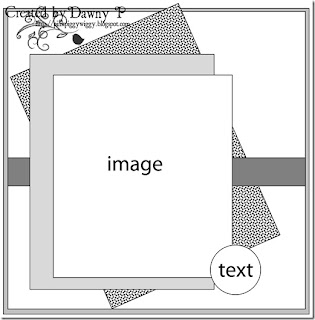
I used this week's sketch (#72) from Papertake Weekly, turning it on its side and doing away with one of the matting layers. My button isn't exactly text, but it's the right shape...

Papertake Weekly Sketch #72

I had a sort of empty space left on the middle paper layer, so I punched a little flower using my corner punch, cut around it, and colored it with more of the red-purples from the Silks 'n' Satins queue. I don't know that it quite fits the rest of the bookmark, but it's a flower in the right colors, so close enough.

(It's not backed on black, that's just the photo background.)

I'm entering this bookmark in the following challenges:

I'm also linking it up to DL.ART's 1000-post Linky Party.

Supplies: (ribbon is Spool o' Ribbon white 1/8" by Offray, and lace is Celebrate It Occasions (i.e. Michaels) white 7/8")

Tuesday, September 25, 2012

Loves Rubberstamps likes Circles Circles Circles!

Likelihood that I will be posting self-congratulatory posts all week: very low. But today I found something very sweet in my blog feed: because so few people participated in the Espresso, Pumpkin, & Aqua color challenge at Loves Rubberstamps, and they liked all our projects, Laura Love is very kindly giving a $5 gift certificate to each of us (all four of us!) who did not win the random draw. She posted all of our projects and declared every one of us to be favorites for the week.

See, my favorite project would have been the lovely card with snowmen on it, by Annie Rose, but over at Loves Rubberstamps they are more generous than that.

This week's challenge is a photo inspiration challenge, and you should check it out, because Loves Rubberstamps is good people.

Friday, September 21, 2012

Bookmarks XXVI: Imperial Rabbit

Imperial purple, a.k.a. Tyrian red, is actually much more red than any of the purples I've used. In this case, a snappy name won out over historical accuracy.

There's a lot of rambling today, so if you like you can click here and skip straight to the final project picture and the challenge listings.

Or maybe the bunny actually is an empress or emperor. I don't know much about the governmental system of rubber stamps.

I've really been abusing my shoulder lately -- too much time using a mouse without good posture and too much time cutting around stamped images. So today I had two resolutions: sit up straight at the computer, and don't make any cuts that aren't long straight lines. This week's sketch from Sketch N Stash seemed perfect: lots of visual interest, probably adaptable to bookmark form, and all rectangles.

Of course, using the sketch is only half the challenge at Sketch N Stash. You also have to use some new or neglected stash items. Fortunately, that played into a couple of other challenges.

Color-wise, I chose to use purple. First, I have several colors of plain purple cardstock that I've not used at all since I bought the pack they're in. Second, purple meets two challenges: Allsorts's "Purple Passion" and The Crafty Bloggers Network's "Purple".

This also means you have to look at another one of my color tests, because a)I still haven't made a reference sheet and b)these mice from October Afternoon are great stuff and deserve to be seen.

You can see I was testing on the index card I used to record the information about the challenge at The Crafty Bloggers Network. And doesn't that rabbit stamp off beautifully? I inked it once for the actual image I used on the project and stamped it off repeatedly on this index card. I love how even the image is, no matter how light it gets! Is this maybe because it is such a solid stamp, and not a line-drawing type image?

The other challenge I had in mind for using neglected stash was My Craft Spot's challenge to use a wild animal. You have no idea how many unused animal stamps I have, and quite a few of them aren't even cats.

I just really like cats, okay? I should do some kind of use-all-the-cat-stamps collage, except I'm afraid then I would learn how many cat stamps I actually have, and then I wouldn't ever be able to get any more. I'm sure most of us have some growing collection like this -- if you don't, please don't tell me so, as I like this illusion.

Anyway, my first thought was to use the absolutely charming raccoon from October Afternoon's Woodland Park stamps. That raccoon was what tipped me over the line between "okay, that goes on my wishlist" and "take my money" for that set, and I still haven't actually used it. But when looking back at the design team samples for My Craft Spot, I realized that GiGi of The Cricut Bug had submitted... a purple card featuring a raccoon. (It's cute, go check it out.) Not the same raccoon, but still.

Needless to say, rather than submit something so very similar but not actually inspired by someone else's work, I decided the raccoon would have to wait for another project. Great minds think alike, I guess?

It's not like there aren't plenty of other wonderful stamps in that set that I also haven't used yet. I chose the larger rabbit. (I had already used the smaller one on one of the Popsicles in the Park bookmarks.) In retrospect, the rabbit is a better choice than the raccoon anyway, both for the sketch and for the bookmark form: the rabbit is taller than it is wide, whereas the raccoon is exactly the opposite.

I also grabbed the purple cardstock I mentioned. Now, these two purples are lovely and bright, but the third purple I wanted to use is very greyish purple -- despite coming from a pack marked "Brights". Then I went and sprayed it with pewter (previously unused!) and silver Shimmer Spritz, which didn't exactly make it a brighter purple, just more sparkly. I'm not sure what I was thinking there.

Edging all the pieces of cardstock saved me. The white cardstock, for example, looked horrible before I edged it in pewter. Then I matted it too, which didn't hurt.

Tip: Papers that just won't go together no matter how much you wish they did? Try edging one in a color that goes with the other. (Or edge both!) The amount of color in the edging won't be enough to go badly with the paper it's on, but it will be enough to make the transition between the two papers work.

So with everything edged and heat-set -- I only really own pigment ink, but decided to take a bit of a break from the embossing powder after yesterday's rather messy effort -- I began construction. At which point I accidentally got a shimmery fingerprint and a smear of glue on my nice pristine white focal point. True, it wouldn't have been that hard to re-stamp, but I wanted to be done! So I went with it.

Tip: Oh no, your clean surface got smudged! I'm sure you meant to go for the distressed look all along, though, right? So rub your fingers around in whatever caused the smudge in the first place and go to town! One smudge is clumsy. Lots of smudging is technique.

C'mon, you know your project needs some shimmery fingerprints too.

I did have some trouble with the criss-cross elements in the sketch; nothing I tried seemed to work, so I left them out. Of course, now I remember that I actually own many many colors of embroidery floss, which might have looked nice. Oh well.

I'm entering this bookmark into the following challenges:

I'm also linking it up to DL.ART's 1000-post Linky Party.

Supplies: (white 110lb. cardstock is from Staples, but the widget doesn't like the picture Staples has)

Thursday, September 20, 2012

Bookmarks XXV: Wish Dragon

Last weekend a friend of mine came over to do some crafting. As she was looking through my stack of bookmarks, she saw that I had been using Lawn Fawn's Critters Ever After pretty heavily: dragons, dragons & unicorns, griffins, even the frog. She told me I couldn't use that set any more. And she loves dragons!

To be fair, she may have also found the rest of the background paper I made with the dragon and unicorn (for Backgrounds Ever After), and that's a lot of dragon and unicorn to come across as you're rummaging through the paper box.

So when I saw this week's challenge at Totally Papercrafts was to "use your favorite stamp", I figured that the dragon was a pretty good choice. I'm not really sure what stamp is my favorite, but the evidence suggests this one ranks pretty high!

A few other challenges in my stack suggested elegance: Cupcake Craft's Script and Gold challenge and, of course, this week's CAS-ual Friday challenge, Black and White Plus One. Black and white and gold with some script sounds pretty elegant, right?

Well, I think the design of the bookmark did okay at elegant, but I'm afraid the implementation did not live up to it. "Look at all my stray embossing powder" is not elegant. Oh well, at least the dragon is looking good.

I have got to stop giving in to the urge to cut around stamped images. My poor shoulder needs a break.

I'm entering this bookmarks in these challenges:

Supplies: (white 110lb. cardstock is from Staples, which has no picture that the linky widget will accept)

Monday, September 17, 2012

Bookmarks XXII: Circles Circles Circles

Once I pulled together the colors for Loves Rubberstamps' "Espresso, Pumpkin, & Aqua" challenge, I liked them a lot more than I thought I would. My taste in colors is rather conventional and I often shy away from pairing across the color wheel. (This is why challenges: to try things you normally wouldn't.)

Of course I had fun finding the exact shade of light blue that matched the color prompt best (it was actually Aqua, which was frankly a bit surprising). Spoiler: I ended up with none of these inks visible on the final bookmark. Sigh.

I also grabbed some papers and cardstock -- I thought the orange one with white swirls echoed the print in the first stripe of the prompt nicely, but otherwise I was just grabbing colors.

The little white-and-aqua circles are from the packaging for an EK Success punch. In fact, the packaging of the very punch that punched them, a one-inch circle. That punch didn't really like how thick the boxboard was, but I got it unstuck from the third attempt eventually...

Shown in Kit:

I tried a couple of sketches, but nothing really seemed to work. Sometimes it is quite hard to make wide card sketches work for a skinny bookmark. It works in my head, but when I lay it out I realize that somehow the bookmark was much wider in my head. Dear my imagination: please take physical reality into account.

Anyway, I stacked up some circles, stamped a little border and heat embossed it in bright aqua embossing powder, and cut some chevron/zigzag things out of a square of textured cardstock. I added the vertical line of cardstock in an attempt to connect the two areas of interest; I think it worked okay. It also looks a bit like a yo-yo or upside-down lollipop, though, which I'm not too sure about.

I am entering this bookmark in the following challenges:

I'm also linking it up to DL.ART's 1000-post Linky Party.

Supplies:

Saturday, September 8, 2012

Bookmarks XIII: The Mage Wars

This week's challenge at Simon Says Stamp & Show is to "Read All About It": make something using text or books, or inspired by them.

I pretty much always make bookmarks when I papercraft, and that seems pretty book-related to me, but I figured that was rather less effort than the challenge designers were expecting. So I made some bookmarks specifically to go with a trilogy of books.

Let me just repeat a picture from my last post to show the book covers:

And here are the finished bookmarks:

That was my first try at reverse stamping, with the black gryphon. I quickly realized I wasn't going to become a master of reverse stamping in a half an hour (hah!), but since I was embossing, I just filled in all the less-than-perfect parts with an embossing pen... fake mastery!

I ended up tying the bookmarks together stylistically, smudging gradient backgrounds based on each cover and then stamping and embossing a gryphon of the title's color on a circle of fancy cardstock. Each bookmark is also splattered with mist flicked from the end of the tube: gold & silver with the black gryphon, gold with the white gryphon, and silver with the silver gryphon, which also helps tie them together. (I'm so glad I came across The Artistic Stamper's Splatters and Speckles Challenge; I wouldn't have thought of doing this otherwise and I love the effect.) Usually I tie bookmark duos together using colors and/or stamps, so doing it mostly with techniques here was new and fun.

In The Silver Gryphon, the gryphon protagonist Tadrith has a twin brother. My Tad has a twin too, the result of an attempt to make the yellow-green paper fit the blue-green of the bookmark better. I liked the green I got by covering it with ink, but alas! Tad #1 was unable to completely resist the ink and became a very dull little silver gryphon. I decided I wanted shiny silver more than I wanted better-coordinated paper.

(Tadrith in the book isn't actually a silver-colored gryphon; he's a member of a scout group called the Silver Gryphons. But just like the cover artist, Jody Lee, I rather skipped that nuance. SHINY GRYPHON IS SHINY.)

I'm entering this bookmark trio in the following challenges:

I'm also linking it up to DL.ART's 1000-post Linky Party.

Supplies: