Showing posts with label divasbydesign. Show all posts

Tuesday, December 11, 2012

Layers of Blue

The current challenge over at Christmas Challenges with Sketches is to use the sketch on a gift bag. You can follow the link to see the sketch if you'd like; they ask that people don't repost it.

It's a very layered sketch. I like it, but normally I wouldn't attempt it -- lots of layers start looking really silly on a 2-inch-wide bookmark! However, I figured that a bag ought to give me plenty of room.

So I rummaged around in my wrapping supplies and found a bag I'd saved from some gift or other. It was blue, which was perfect: clearly I should do something wintery and snowflakey with the layers of the sketch.

I invested my creativity in making paper designs rather than altering the sketch much -- I decorated all the papers myself (except for the black one with big glittery white dots, which was a scrap). I think the black with silver snowflakes is probably the prettiest one... too bad it's mostly covered up!

Tip: My craft sheet was pretty messy after creating the first three or four papers -- white ink, silver ink, shimmer spritz and even some stray glitter and embossing power were everywhere! Don't waste this lovely mess -- take another piece of paper and rub it all over the craft sheet. Now you have a cleaner craft sheet and a cool piece of paper -- mine's the darker blue piece with the dove in the upper right.

I had a specific color inspiration, hence the use of black as well as blue and white -- but I can't show it, because it's the present inside the bag, and the recipient reads my blog.

(Hey Anya, I have a present for you...)

I'm entering this bag in the following challenges:

Supplies:

Sunday, December 9, 2012

Bluebird of Winter

Well, anyway, the bird is blue, even if it's not a bluebird. And the birdhouse is pretty wintery!

For this birdhouse, I decorated with stamping rather than with scraps. Metallic blue snowflakes in various stages of stamping off decorate the white roof; I stamped the cute little bird on the front, and a snowman on the back:

I'm entering this snowy birdhouse in the following challenges:

Friday, November 23, 2012

Bookmarks L: Retro Blooms

Fifty bookmarks, that's what the "L" in the title means. Well, a few more, because some are pairs or triples. That's a lot of bookmarks. It's still way fewer bookmarks than I've got books, though.

There's nothing particularly 50-ish about this bookmark, except perhaps the colors. I don't really have a good grasp on popular color combos from sixty years ago, but certainly the turquoise seems about right...

But that wasn't the inspiration for this bookmark. It was very simple: I had some new paper. I had a highly unseasonal stamp set. And after some mix-and-matching of the papers to get two that worked together, I had this bookmark. I like how the froggie is slotted on top of the sign -- it seems much more dynamic than simply putting the two pieces of paper next to each other.

I suppose it's somewhere around late spring in the Southern Hemisphere right now, so hey! It's not unseasonal for everyone.

I'm entering this seasonal-depending-on-your-hemisphere bookmark into the following challenges:

Supplies: (the tape is some of Target's printed paper tape)

Thursday, October 11, 2012

Bookmarks XXXVIII: Join the Dance

Look, I know we've seen this fairy a lot lately. She showed up in a Saturday State of the Stash post, and then again on my worktable.

Well, now she gets a post (and a bookmark) of her very own.

Now, one of the great things about this stamp is that she isn't at all seasonal. She'll look great among snowflakes, falling leaves, flowers, fruit, whatever you like. In this case, she's a autumnal fairy, joining the dance of the swirling fall leaves. (They are leaves, but not to scale, and stamped all over each other -- I was going more for the impression of a lot of leaves than a crisp image.)

She was stamped in Eggplant, which of course is quite purple, but on the orange background it seems to have lost most of the purple and become a sort of dark rust -- and it's not just the photo, it looks like that for real. I wonder if it actually changed color or it's just one of those optical illusions where your perception of color is affected by colors around it?

This bookmark is made of 100% scraps! The scrap on which I originally stamped the fairy is a remnant of Popsicles in the Park, the scrap of copper cardstock is left over from Copper & Chartreuse, and the shimmery red backing piece is the other half of the backing from To Sail Beyond the Sunset.

For the life of me I can't figure out what earlier project created the brown scraps, but you can see it on my desk yesterday: it definitely wasn't a full sheet of mat. Maybe I cut some off for a project and then decided it didn't work? So somewhere there should be another scrap, the other part of the paper...

I'm entering this bookmark into the following challenges:

Even though I haven't used any stamps from the companies kindly sponsoring all of these challenges -- well, if I've entered but not used your stamps, it means I haven't got any and would like to win some!

I'm also linking this up to DL.ART's October Linky Party.

Supplies: (the little strips of brown leafy paper are from DCWV's Autumn Melody matstack, which doesn't seem to be for sale anywhere linkable)

Friday, September 21, 2012

Bookmarks XXVII: Acorn & Oak Leaf

I am far too sleepy for it to be this early on Friday night, so this is going to be quick rather than ramble-y. I'm fairly sure I haven't used any fantastic new techniques here, but feel free to ask in the comments if you want to know how I did something.

And lo, there was an autumnal bookmark, and it was layered shimmery taped distressed heat embossed good.

I'm entering this bookmark into these challenges:

Supplies: (patterned paper is from DCWV's Autumn Melody matstack, washi or "crafting" tape is from Recollections/Michaels, and the stamps are from an Inkadinkado mini-set. I can't find any product listings for these online, so they're not in the widget.)

Bookmarks XXVI: Imperial Rabbit

Imperial purple, a.k.a. Tyrian red, is actually much more red than any of the purples I've used. In this case, a snappy name won out over historical accuracy.

There's a lot of rambling today, so if you like you can click here and skip straight to the final project picture and the challenge listings.

Or maybe the bunny actually is an empress or emperor. I don't know much about the governmental system of rubber stamps.

I've really been abusing my shoulder lately -- too much time using a mouse without good posture and too much time cutting around stamped images. So today I had two resolutions: sit up straight at the computer, and don't make any cuts that aren't long straight lines. This week's sketch from Sketch N Stash seemed perfect: lots of visual interest, probably adaptable to bookmark form, and all rectangles.

Of course, using the sketch is only half the challenge at Sketch N Stash. You also have to use some new or neglected stash items. Fortunately, that played into a couple of other challenges.

Color-wise, I chose to use purple. First, I have several colors of plain purple cardstock that I've not used at all since I bought the pack they're in. Second, purple meets two challenges: Allsorts's "Purple Passion" and The Crafty Bloggers Network's "Purple".

This also means you have to look at another one of my color tests, because a)I still haven't made a reference sheet and b)these mice from October Afternoon are great stuff and deserve to be seen.

You can see I was testing on the index card I used to record the information about the challenge at The Crafty Bloggers Network. And doesn't that rabbit stamp off beautifully? I inked it once for the actual image I used on the project and stamped it off repeatedly on this index card. I love how even the image is, no matter how light it gets! Is this maybe because it is such a solid stamp, and not a line-drawing type image?

The other challenge I had in mind for using neglected stash was My Craft Spot's challenge to use a wild animal. You have no idea how many unused animal stamps I have, and quite a few of them aren't even cats.

I just really like cats, okay? I should do some kind of use-all-the-cat-stamps collage, except I'm afraid then I would learn how many cat stamps I actually have, and then I wouldn't ever be able to get any more. I'm sure most of us have some growing collection like this -- if you don't, please don't tell me so, as I like this illusion.

Anyway, my first thought was to use the absolutely charming raccoon from October Afternoon's Woodland Park stamps. That raccoon was what tipped me over the line between "okay, that goes on my wishlist" and "take my money" for that set, and I still haven't actually used it. But when looking back at the design team samples for My Craft Spot, I realized that GiGi of The Cricut Bug had submitted... a purple card featuring a raccoon. (It's cute, go check it out.) Not the same raccoon, but still.

Needless to say, rather than submit something so very similar but not actually inspired by someone else's work, I decided the raccoon would have to wait for another project. Great minds think alike, I guess?

It's not like there aren't plenty of other wonderful stamps in that set that I also haven't used yet. I chose the larger rabbit. (I had already used the smaller one on one of the Popsicles in the Park bookmarks.) In retrospect, the rabbit is a better choice than the raccoon anyway, both for the sketch and for the bookmark form: the rabbit is taller than it is wide, whereas the raccoon is exactly the opposite.

I also grabbed the purple cardstock I mentioned. Now, these two purples are lovely and bright, but the third purple I wanted to use is very greyish purple -- despite coming from a pack marked "Brights". Then I went and sprayed it with pewter (previously unused!) and silver Shimmer Spritz, which didn't exactly make it a brighter purple, just more sparkly. I'm not sure what I was thinking there.

Edging all the pieces of cardstock saved me. The white cardstock, for example, looked horrible before I edged it in pewter. Then I matted it too, which didn't hurt.

Tip: Papers that just won't go together no matter how much you wish they did? Try edging one in a color that goes with the other. (Or edge both!) The amount of color in the edging won't be enough to go badly with the paper it's on, but it will be enough to make the transition between the two papers work.

So with everything edged and heat-set -- I only really own pigment ink, but decided to take a bit of a break from the embossing powder after yesterday's rather messy effort -- I began construction. At which point I accidentally got a shimmery fingerprint and a smear of glue on my nice pristine white focal point. True, it wouldn't have been that hard to re-stamp, but I wanted to be done! So I went with it.

Tip: Oh no, your clean surface got smudged! I'm sure you meant to go for the distressed look all along, though, right? So rub your fingers around in whatever caused the smudge in the first place and go to town! One smudge is clumsy. Lots of smudging is technique.

C'mon, you know your project needs some shimmery fingerprints too.

I did have some trouble with the criss-cross elements in the sketch; nothing I tried seemed to work, so I left them out. Of course, now I remember that I actually own many many colors of embroidery floss, which might have looked nice. Oh well.

I'm entering this bookmark into the following challenges:

I'm also linking it up to DL.ART's 1000-post Linky Party.

Supplies: (white 110lb. cardstock is from Staples, but the widget doesn't like the picture Staples has)

Sunday, September 16, 2012

Bookmarks XX: Primary Knight

I'm a little too tired to weave a narrative of challenge inspiration, which anyway is always "look for several challenges that can go together and do them", so I'm just going to list the challenges I'm entering up front.

I'm entering this bookmark in the following challenges:

I'm also linking it up to DL.ART's 1000-post Linky Party.

At this point you know I've made a bookmark with a colorful knight and dragon. Also, the dragon has wings. They're likely childish in style.

The picture seems a little anticlimactic.

It's bright and cheerful, although the composition could have been better. At the very least I could have placed the rear of the horse off the edge, mirroring the way the dragon is positioned. Still: bright and cheerful. Rainbow colors may not exactly stretch my boundaries but darn it they feel good. Look at this bookmark. Look at this selection of inspiration photos from Art Impressions. Tell me you don't feel like your day is a little more cheerful.

Once I called the bookmark "Primary Knight" I began to wonder whether the knight is fighting the dragon because it's a dragon, or because it's made up of secondary colors. Clearly he's already vanquished something purple.

Supplies: (white 110 lb. cardstock is Staples brand)

Thursday, September 13, 2012

Bookmarks XIX: Tasty Trendy Bright

Having found some neon yellow, I made a sort of radioactive cupcake thing.

In addition to hot neon colors inspired by Simon Says Stamp's "We're So TRENDY" and The Stamp Man's "Summer Sizzlers" challenges, I grabbed the sketch from Flourishes' "Any Which Way":

I think neons should always be on black. But of course applying the neon washi tape directly to black would just make it dull, and since I don't have any neon embossing powder I wasn't too confident about stamping showing up well on black either.

So I did them on white.

I stamped a cupcake onto a piece of white cardstock and then ripped lots of small pieces of washi tape to outline it in a sort of explosion of neon stripes. I liked the ragged look, so instead of cutting the washi from the edges of the white cardstock, I picked up the whole sticky mess and smacked it on the base bookmark. I still liked the ragged look, so I left it there.

I was a little stumped on what to do for the small decorative element in the sketch. I could leave it out as it doesn't seem terribly integral to the sketch, but at that point the sketch is basically "that thing I do all the time with a stripe and a focal element", and where's the challenge in that? Then I saw a little roughly-square piece of black cardstock. Aha! I cut it down a size repeatedly, creating chevrons, and pointed them at the cupcake. Bringing the black back on top of the neons really took the bookmark to a more forceful visual level, so I'm very glad for the inspiration from the sketch!

I'm entering this bookmark in the following challenges:

Supplies: (white 110lb. cardstock from Staples; washi/crafting tape from Recollections -- I'll update the widget if I can find a good link for either)

Sunday, September 9, 2012

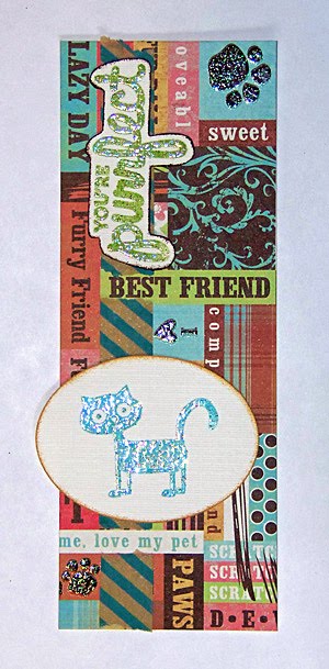
Bookmarks XV: Purrfect Pet

Sentiments are almost always super-cheesy. I look at one on a sheet of stamps and think "Why is there not another image instead of this trite sentiment?" But when I see other people's finished work, they look good -- of course they're still just as cheesy, but somehow, on finished pieces, they work. I don't know how this transformation happens for the rest of you, but this time, for me, I think it was the glitter.

Click here to skip the rambling and go directly to the project and challenge list.

This week's Divas by Design challenge was Friendship. I was pretty stumped until, looking through DCWV's Pets matstack for something else, I happened across a piece of cardstock which seemed pretty set on loving its animal friends. That was pretty much all I needed to pull together a project.

I used the wonderful little yarn-ball stamp to do some color testing with inks from Color Box's Surf's Up, Wood Grain, and Rain Forest cat's eye queues. In other news, I should probably make a permanent reference instead of re-color-testing for each project.

I'm also following this week's Lawnscaping sketch challenge:

I turned the sketch sideways. For the vertical element, I used some washi (technically Recollections "crafting") tape. I did allow a few of the phrases on the paper to break the line, because I wanted to keep them intact for the friendship theme.

The tape line doesn't stand out much on the busy paper. Maybe all it is doing is highlighting the phrases that break it? Anyway, I'm pretty happy with the result, and I even like how the sentiment turned out! In that font, with that much glitter, it is owning the horribly cheesy pun, and I can respect that.

I'm entering this bookmark in the following challenges:

I'm also linking it up to DL.ART's 1000-post Linky Party.

Supplies: (I can't find the tape to list it in the widget, but it is Recollections crafting tape from Michael's)