Showing posts with label thecraftypad. Show all posts

Sunday, October 28, 2012

Bookmarks XLVII: The Cat Who Came For Christmas

Kitty cats and ornaments and Christmas coziness: that's this bookmark.

I've photographed it on a page from Cleveland Amory's The Cat Who Came For Christmas. I've shamelessly stolen his title, as you may have noticed, but I feel obligated to say that the cat in the book is white, whereas the cat on the bookmark is brown-striped. And red, too, which isn't exactly natural but is Christmas.

I'm entering this festive feline bookmark into the following challenges:

Supplies:

Thursday, October 25, 2012

The Crafty Pad likes Paisley Tea!

My Paisley Tea bookmark was chosen as one of the Top 5 in The Crafty Pad's "Distress It!" challenge!

I'm awfully pleased they liked it; it's nice to have the effort I put into that one rewarded!

Bookmarks XLVI: Grey, Red, and Black

I used to think there were two kinds of squirrels: grey squirrels, and red squirrels. Then I moved to Michigan, where there are also black squirrels. I'm still not totally used to it, and I've been here for more than five years. Black squirrels!

(There is also a quasi-fourth type of squirrel here, which I call "who dipped half that black squirrel in a bucket of bleach?" squirrels.)

The internet tells me that black squirrels are just melanistic (i.e. very dark) grey squirrels, and can have all sorts of weird mottling patterns, but still. Black squirrels! They're not less cool-looking for the knowledge.

So when I wanted to make a fallish bookmark with some scraps of acorny paper and my new Lawn Fawn Critters in the 'Burbs stamps, the squirrel (and the acorn) were the obvious choice, and doing squirrels in three colors was only a very small step from that. They're all stamped and embossed in gold, and then I colored them in with silver (for grey), copper (for red), and black (for black... you probably figured that out) and stamped and embossed some acorns in the same set of colors.

The background brown paper is a scrap I used to soak up spray from the craft mat a while ago and then set aside to dry. I love to do this, especially with bookmark-y sized scraps of plain paper; they go back into the paper box to become neat backgrounds for future projects (like this one). I'm pretty sure there's both gold and copper spray on here, although I can only swear to the copper. In the picture it looks like there's silver as well, but that's just the lighting.

I have some lovely novels starring squirrels that I should have used to photograph this bookmark on, but they're in a box -- oh, shoot, the Redwall books aren't boxed, I could have used one of them! Anyway, I ended up putting it on a page of The Lion, the Witch, and the Wardrobe.

I'm entering this squirrely bookmark into the following challenges:

Supplies: (the acorn paper is from DCWV's Autumn Melody matstack)

Sunday, October 14, 2012

Bookmarks XXXIX: Paisley Tea

This bookmark fought me and fought me and I'm not entirely certain I've won. Still, it's hard to lose completely with a bookmark: regardless of its aesthetic appeal, it will certainly be successful at marking my place in a book.

I do not think I ended up making this bookmark out of any of the things I started with. I had visions of cherries and milkshakes and pink, like a pretty vintage ice cream advertisement poster.

Well, I have a cherry background I'm happy with. And I have a cute little milkshake all cut out and pink as you could wish. But the milkshake doesn't work on the background! If I don't back it with something, it blends in. If I do, the backing is awkward and pushes the cherry background into a red muddle. Argh!

So I put that aside, picked up some pretty purple paisley paper and a scrap I've been using to wipe up sprays from my craft mat, and made tea. Pretty pink & purple paisley tea. I whacked at some white lace ribbon with purples and pinks and added that too, to up the vintage quota.

I like the teapot, but I must admit that the teacup is a bit of a muddle: i.e., until I tell you that it is a teacup, it's just this muddled shape. D'you think it would be easier to see if I colored all the teacup parts in with the purple pen? Maybe I'll do that.

(I suppose it's fitting that this distressed piece of paper ends up being part of a tea bookmark -- its first round of distressing, way under all the pinky-purple, was Tea Dye Distress Ink.)

I'm entering this bookmark into the following challenges:

Supplies: (purple paisley cardstock is from Recollections/Michaels, and lace is Celebrate It Occasions/Michaels white 7/8")

Sunday, September 30, 2012

Bookmarks XXXV: Pressed Flowers

I'm really happy with the background I made for this bookmark, and I like it overall. But I'm pretty sure this vintage-y lace-y stuff is not my strength.

Partly because now I have to remember to hide the ribbon and lace ribbon from my cat, who loves to eat it. Not only is that bad for the ribbon, it's pretty bad for the cat.

For this vintage-y lace-y thing, I took my main inspiration from two different photo inspiration challenges: Loves Rubberstamps and Stampalot. I'm not actually entering the Stampalot challenge, because I'm a bit late for it, but it seemed only fair to show the inspiration photo anyway.

Loves Rubberstamps Pintrest Photo Inspiration Challenge Stampalot September Inspiration Challenge

Lace-flowers-vintage was the message I got from both photos.

Now, most of my inks are pigment inks. Last night I stamped myself a floral background on a white base, sometimes stamping twice without re-inking for a faded look. I was also determined to color-distress the edges. With pigment inks. And I don't actually have any brown inks that aren't really dark chocolate-y chestnut-y brown.

The closest I do have to light brown is the Amber Satin in my Silks 'n' Satins Colorbox Queue. It's sort of a metallic taupe. I know, distressing with a metallic pigment ink? It's not ideal. But I tried it and I think it worked out okay.

I did go out this morning and get some Tea Dye Distress ink. If that's what Tim Holtz thinks things dyed with tea looks like, he maybe ought try tea-dying again, because this is way too dark and way too red-orange. I mean, sure, I can dye things pink with tea, but that is because I drink herbal strawberry tea, which involves no actual tea leaves.

Actual black tea does not dye an orangeish color and it's usually not this dark. I wanted neither dark nor orange for this project -- although I did use it to color a bit of white ribbon, and that turned out to be a color I could use. I didn't like it for edging.

I think maybe dye inks just aren't for me? I guess I should give the Antique Linen and Old Paper colors a try before I completely give up on a product designed to do exactly what I'm trying to do with it. Sheesh, I'm glad I didn't try Vintage Photo, that stuff's even darker than Tea Dye. Am I using it wrong? Edging doesn't seem like a technique that's easy to mess up.

Where was I? Oh, yes, so then I tone-on-tone stamped a couple of small pieces of paper with the same flowers as the background -- you can't see it in the photo and can hardly see it in real life, but at least it adds some texture -- and edged them too. With Amber Silk. I stamped myself a little button, backed it on another piece of cardboard, pierced it, threaded the Tea Dye'd ribbon through and tied it in a bow. I couldn't make myself use a real button; it would be too hard to shut a book on it. As it is I have my doubts about the knot of the bow.

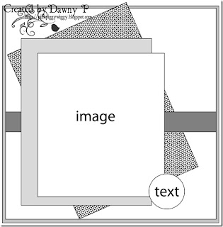
I used this week's sketch (#72) from Papertake Weekly, turning it on its side and doing away with one of the matting layers. My button isn't exactly text, but it's the right shape...

Papertake Weekly Sketch #72

I had a sort of empty space left on the middle paper layer, so I punched a little flower using my corner punch, cut around it, and colored it with more of the red-purples from the Silks 'n' Satins queue. I don't know that it quite fits the rest of the bookmark, but it's a flower in the right colors, so close enough.

(It's not backed on black, that's just the photo background.)

I'm entering this bookmark in the following challenges:

I'm also linking it up to DL.ART's 1000-post Linky Party.

Supplies: (ribbon is Spool o' Ribbon white 1/8" by Offray, and lace is Celebrate It Occasions (i.e. Michaels) white 7/8")

Friday, September 28, 2012

Save Lids To Save Lives

I made a not-bookmark thing! I haven't been able to think of what to make for the various Breast Cancer Awareness/Think Pink challenges going on this month, you see. I mean, eventually I did think pink and submitted that, but it seemed a little wrong not to do something for BCA too.

I thought maybe I'd make a thing to hang in the shower to remind me to do self-exams. That is, I could make a thing that looked very much like a bookmark, laminate it, and call it good. (I debated what it should say. Possibilities included "Feel Yourself Up" and "Check Yourself Before You Wreck Yourself".)

In trying to think about that, I thought I might use some of the yoghurt lids around here -- I don't have any ribbons, real or stampy, but the lids do because they're part of Yoplait's Save Lids to Save Lives program.

Then I thought, wait, it seems a shame to sacrifice something that's actually useful just because you're sad you can't find any ribbon stamps. Because we do eat significant quantities of yoghurt, and we do save the lids and send them in. Usually they collect on top of the microwave. If we're particularly neat and fussy they might end up in a ziplock bag, still on top of the microwave.

I had a brainwave. I could make something to keep them in, make them easily countable, and contain the mess! Visions of tiny envelopes full of yoghurt lids danced in my head.

At this point I've got a fairly good idea of what's sitting about in the local big box craft stores, and tiny envelopes haven't come to my attention lately. I briefly contemplated making them. Then I contemplated it some more. I decided that was definitely a backup plan.

So I went to Staples. I not only found tiny envelopes, I found a bright pink index card holder to put them in! Normally I am not very into bright pink (or pale pink, for that matter), but it was clearly perfect for this project.

The ideal envelopes would be a bit shorter and squatter, but compared to making a bunch, me and my achy shoulder will take no. 1 coin envelopes every day of the week.

I determined that I could probably stuff five or so lids into an envelope without becoming frustrated. It would be neater if they held 10 apiece -- since each lid represents 10 cents, an envelope would be $1 -- but they are what they are. So two envelopes are $1. I determined to stamp the number 5 on each envelope, a little bit to remind my future self what I was supposed to do... but mostly because by gosh I was going to stamp something.

I tried three pinks, all heat embossed with sparkly embossing powder, and settled on the brightest one. It goes best with the index card holder and with the lids themselves.

Since it's not terribly important what the envelopes look like, I kept all three and did 17 more in the bright pink, for a total of twenty. (Stamping and embossing 17 more was pretty easy; since this is pigment ink, and dries slowly, I did a couple of batches of stamp-then-emboss rather than doing them one at a time.) The envelopes are a bit loose in the holder right now, but I think once they're stuffed with lids they will be packed tight.

That paper blank clearly needed something on it. I choose to write out the address we'll be sending the lids to -- that way we won't have to squint at a lid when the time comes. I decorated the corners with little pink ribbons, hand-drawn. I have some confidence that, given the context, they will probably not be mistaken for stylized fish.

I popped the card back into its pocket. I like it there; now the holder is more than an anonymous pink thing.

To finish things off, I wrote out "Save Lids to Save Lives" again on a white strip of cardstock and taped it to the spine of the holder. (You can see I did not succeed in stopping my handwriting from getting smaller as I wrote. Oh well.)

And that's my BCA/Think Pink project -- it's pink and it holds lids that will eventually be sent off so that Yoplait donates a couple more dollars to the Susan B. Komen foundation. If we fill it, it will only be $10, but it would be easy to send away the little envelopes and stamp more to start collecting another $10 of lids. Probably the fanciest thing about it is the glittery embossing powder -- it's not the epitome of amazing papercraft projects by any means -- but it will serve a useful purpose.

Probably on top of the microwave.

I'm entering this little project in the following challenges:

Undisclaimer: I'm not being paid or sponsored or anything like that by Yoplait. Alas.

Supplies: (envelopes and index card case are from Staples, which is just very unfriendly to the linking widget)

Friday, September 21, 2012

Bookmarks XXVII: Acorn & Oak Leaf

I am far too sleepy for it to be this early on Friday night, so this is going to be quick rather than ramble-y. I'm fairly sure I haven't used any fantastic new techniques here, but feel free to ask in the comments if you want to know how I did something.

And lo, there was an autumnal bookmark, and it was layered shimmery taped distressed heat embossed good.

I'm entering this bookmark into these challenges:

Supplies: (patterned paper is from DCWV's Autumn Melody matstack, washi or "crafting" tape is from Recollections/Michaels, and the stamps are from an Inkadinkado mini-set. I can't find any product listings for these online, so they're not in the widget.)