Showing posts with label craftybloggersnetwork. Show all posts

Thursday, November 29, 2012

Bookmarks LIII: Dryad Rudy

Originally, Christmas Pixie Rudy here had a bright red paper-pieced nose. Then I checked to see how securely it was glued down, and spang! Somewhere, there is a little red nose. But it is not on Rudy.

So now Rudy's doing a study abroad program with the forest dryads, a.k.a. is completely green. At least I've given him a Christmas-y background!

Rudy himself is a scrap -- an example stamped onto a scrap. The green strip is also a scrap, cut away from a larger piece of dry-embossed paper. The red background isn't, but I'm still pretty happy with the scrap-to-new-paper use on this -- two out of three isn't bad, hey?

I'm entering this bookmark into the following challenges:

Supplies: (I don't know what the plain green paper or the embossing plate I used on it are; I did it over at a friend's place.)

Friday, October 19, 2012

Bookmarks XLI: Put on Your Party Hat

I loved the color scheme in the card that Katie made for Loves Rubberstamps' Sensational Sunday Inspirations post.

Plus I realized that it gave me a reason to cut into a fresh sheet of paper, which is always fun.

Going through my stamps, none of them really seemed to fit the color combination until I came to a party/Happy Birthday set. So, although it isn't really a common subject for bookmarks, I made a party bookmark.

I have a lot more use for bookmarks than I think I would for cards, see.

Originally it was just going to be the balloons and the sentiment, but I kinda messed up punching the stars in the lower right corner. So I stamped and embossed the party hat (using it as an excuse to cut into yet another new piece of paper), cut it out, colored it in to help the pattern appear, and whacked it jauntily over my mistake. To help the colors fit, I used the same pen to color a bit of one of the balloons.

Then I put some of the punched-out stars onto the hat. Originally they were both centered on circles, but the upper one seems to have shifted off a bit... oops.

It only took me 40 sets of bookmarks to figure out that hey, do you know what would make a good backing paper for photographing bookmarks? BOOKS. This one is Pippi Longstocking, at the beginning of the last chapter... where she throws herself a birthday party.

I'm entering this bookmark in the following challenges:

Supplies:

Thursday, October 11, 2012

Bookmarks XXXVIII: Join the Dance

Look, I know we've seen this fairy a lot lately. She showed up in a Saturday State of the Stash post, and then again on my worktable.

Well, now she gets a post (and a bookmark) of her very own.

Now, one of the great things about this stamp is that she isn't at all seasonal. She'll look great among snowflakes, falling leaves, flowers, fruit, whatever you like. In this case, she's a autumnal fairy, joining the dance of the swirling fall leaves. (They are leaves, but not to scale, and stamped all over each other -- I was going more for the impression of a lot of leaves than a crisp image.)

She was stamped in Eggplant, which of course is quite purple, but on the orange background it seems to have lost most of the purple and become a sort of dark rust -- and it's not just the photo, it looks like that for real. I wonder if it actually changed color or it's just one of those optical illusions where your perception of color is affected by colors around it?

This bookmark is made of 100% scraps! The scrap on which I originally stamped the fairy is a remnant of Popsicles in the Park, the scrap of copper cardstock is left over from Copper & Chartreuse, and the shimmery red backing piece is the other half of the backing from To Sail Beyond the Sunset.

For the life of me I can't figure out what earlier project created the brown scraps, but you can see it on my desk yesterday: it definitely wasn't a full sheet of mat. Maybe I cut some off for a project and then decided it didn't work? So somewhere there should be another scrap, the other part of the paper...

I'm entering this bookmark into the following challenges:

Even though I haven't used any stamps from the companies kindly sponsoring all of these challenges -- well, if I've entered but not used your stamps, it means I haven't got any and would like to win some!

I'm also linking this up to DL.ART's October Linky Party.

Supplies: (the little strips of brown leafy paper are from DCWV's Autumn Melody matstack, which doesn't seem to be for sale anywhere linkable)

Tuesday, October 9, 2012

Bookmarks XXXVII: Pair o' Pairs

Here's the story: I had rescued a particularly hideous greenish mustard piece of cardstock from the floor, so it was sitting on my cutting mat. I was paging through DCWV's "Sweet" matstack looking for something to think pink with, because hey, right now that's enter-able into about a dozen challenges without even stretching. (Look, they don't always have to be challenging.) And then there was this floral pattern incorporating pink and an almost mustard-y yellow. It kinda looked like it would go with that ugly cardstock.

I determined to force the issue. Almost-coordinating papers don't give you the opportunity to use up something ugly every day, after all.

I also wanted to use some of my new fruits and sweets stamps. And it hit me that, hey, pears are a yellowy-greenish color!

There was also a light blue on the floral print, giving me the opportunity to use some fairly dull and uninspiring light grey-blue cardstock as well... and to make a pair of pear bookmarks.

I promise that's the only play on words I'm deliberately committing here. And I totally would have stamped a bunch of grapes for the blueish bookmark if I'd had such a stamp, just to avoid the pun. 'Cause I like clever puns, but this one is not clever.

Also, that blue pear kinda weirds me out.

I stamped everything in pink (and clear embossed), edged with pink, and used a little of my new pink polka-dot washi tape in an effort to play up the pinkness for all those Breast Cancer Awareness / Think Pink competitions.

To be fair to the grey-blue cardstock, it's not entirely uninspiring. However, the only thing it suggests to me is rainy days, and I own no cloud, raindrop, or umbrella stamps. So.

I'm entering this pear pair of bookmarks into the following challenges:

I'm also linking it up to DL.ART's October Linky Party.

Supplies: (washi tape is "printed paper tape" from Up & Up / Target)

Saturday, September 29, 2012

Bookmarks XXXIV: All Hallows Eve

I gotta keep better track of challenge rules. Three of the challenges that went into the design of this bookmark, I can't submit to because they have a low limit on the number of combined challenges. Normally, I note this down and plan around it. This time I did not.

To skip me rambling on about challenges I didn't even enter, you can click here to jump straight to the project picture and the challenges I did enter.

The first challenge that I used but won't be entering is Touch Twin Color Challenge #26, from which the color inspiration mainly came.

Touch Twin only allows five combined challenges. I like the color combination a lot, and the challenge doesn't end for a little less than a week, so I'll make something else to submit there.

The second challenge that I designed for but won't submit to is Frilly and Funkie: Fall into Fall, which asks us to use fall colors and also, of course, to be vintage-y in either a frilly or a "funkie" way. I don't know that I actually succeeded in making something they would consider "funkie", but I sure gave it a shot, smooshing colors around and attacking edges with my craft knife and generally stamping things over other things and all. I spritzed things on already-inked-up stamps and rubbed paper around in the pretty mess left on my craft sheet! I did not adhere odd bits of metal, but this is a bookmark, not a tag, and it has to fit in a closed book.

Frilly and Funkie allows only four combined challenges. As their rules quite reasonably explain, "We are hoping that you will make a card for our challenge, not use our challenge to fit a card that you have already made." What makes me sad is that I did make a project for their challenge: it was one of my primary motivators -- it just also happens to work for a bunch of other challenges that don't mind more combinations. (Shockingly, as it is fall in the northern hemisphere, lots of challenges involve fall colors right now.)

The third challenge that I incorporated but won't be submitting to is Tando Creative: Leaves and or Trees. I wanted to put a bare-branched tree in front of my moon, but that just didn't work out. In the end I resorted to stamping a leaf stamp a bunch of times on the bottom of the bookmark in several fall colors. It looks really neat, but you can't see it in the photo very well.

Tando Creative allows only five combined challenges. To be quite fair, this was a challenge that I was trying to fit in just because I could, so in this case the combination limit has served its purpose. Since the challenge ends in fewer than 24 hours I doubt I'll be making something else to submit. Oh well.

I do want to repeat that I do understand why these limits exist. They may not be the perfect solution if you don't want scattershot entries in your contest, but they are a nice clear easy-to-implement one, and that counts for a great deal. My complaints here are really a result of poor record-keeping on my part, and shouldn't reflect negatively on the challenges themselves.

Of course I just could have submitted it to these three challenges + the sketch challenge I used, but since part of the fun for me is combining as many challenges as I can, I decided not to.

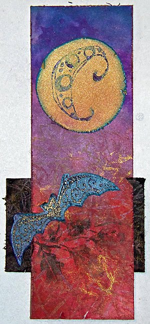
I ended up making a sort of Halloween/Fall bookmark: colors mainly in red, purple, and gold, with a Halloween moon in the night sky and a bat sweeping through some branches. Once I thought of the moon I knew exactly which sketch I was going to use, too, because this week's Tuesday Morning Sketch (#165) has a great big round element in it.

And it is so beautifully bookmark-adaptable! I did not even have to flip it. The big circular element became the moon, of course. The banners became black branch silhouettes, and the collections of embellishments became a bat.

I am entering this bookmark in the following challenges:

I'm also linking it up to DL.ART's 1000-post Linky Party.

Supplies:

Thursday, September 27, 2012

Bookmarks XXXIII: Cold Outside

Why is it that I can weave jillions of technique, color, and material challenges together without much of a problem, but I always hit a snag with adding a dang sentiment? It can't really be this hard!

Well, I guess it can be legitimately difficult when I am making a Christmas-y/winter-y bookmark and I have no such sentiments.

I stamped -- and paper-pieced, a first for me -- a cute set of mittens for the bookmark, so I wanted a sentiment to go with them and sort of shade the whole creation towards the Christmas-y side of winter-y. Obviously there's nothing specific to Christmas about a pair of mittens, especially for folks in the southern hemisphere!

And that is why I have been singing Christmas carols all evening, ones about the cold. In the end I had a bit of a hard time deciding between "Baby, It's Cold Outside" and "Let It Snow" (from which I was going to use the phrase "all the way home I'll be warm"). On the one hand, four words are a lot easier to squeeze in than six. On the other hand, have you ever really listened to the lyrics for "Baby, It's Cold Outside"? It's actually kinda creepy. Hey there, dude, spiking your lady's drink to get her to stay is not cool.

Regardless, aesthetics won out and that's the sentiment I ended up using, but please understand that on my bookmark it means "so put on some mittens", and not anything else.

Listening to the meaning of lyrics is awful and I recommend you never do it.

Anyway, I spent about an hour writing this silly four-word phrase out -- in pen, in embossing pen and powder, on strips of washi tape, in capitals, in lowercase, in seventy-odd combinations of the above... and finally I realized that not ten feet away was a computer with a color printer and the ability to download fonts. This one's called "Frosty", and is by Ben Balvanz of Font-a-licious. It's licensed for personal use, just like most stamp images are -- although I doubt it has any kind of angel policy.

All of the shiny metal is silver, but there was this light, and it was yellow, see, so a bunch of it looks gold. Which is kinda cool, but not an accurate representation of the project.

Christmas Challenges asks that people do not post their sketches (even to credit them, I guess?), but instead link to the relevant post. So there you are; some challenges absolutely require you post their inspiration pics, and some absolutely require that you not do so. Both approaches make a certain amount of sense.

I'm entering this bookmark in the following challenges:

I'm also linking it up to DL.ART's 1000-post Linky Party.

Supplies:

Friday, September 21, 2012

Bookmarks XXVI: Imperial Rabbit

Imperial purple, a.k.a. Tyrian red, is actually much more red than any of the purples I've used. In this case, a snappy name won out over historical accuracy.

There's a lot of rambling today, so if you like you can click here and skip straight to the final project picture and the challenge listings.

Or maybe the bunny actually is an empress or emperor. I don't know much about the governmental system of rubber stamps.

I've really been abusing my shoulder lately -- too much time using a mouse without good posture and too much time cutting around stamped images. So today I had two resolutions: sit up straight at the computer, and don't make any cuts that aren't long straight lines. This week's sketch from Sketch N Stash seemed perfect: lots of visual interest, probably adaptable to bookmark form, and all rectangles.

Of course, using the sketch is only half the challenge at Sketch N Stash. You also have to use some new or neglected stash items. Fortunately, that played into a couple of other challenges.

Color-wise, I chose to use purple. First, I have several colors of plain purple cardstock that I've not used at all since I bought the pack they're in. Second, purple meets two challenges: Allsorts's "Purple Passion" and The Crafty Bloggers Network's "Purple".

This also means you have to look at another one of my color tests, because a)I still haven't made a reference sheet and b)these mice from October Afternoon are great stuff and deserve to be seen.

You can see I was testing on the index card I used to record the information about the challenge at The Crafty Bloggers Network. And doesn't that rabbit stamp off beautifully? I inked it once for the actual image I used on the project and stamped it off repeatedly on this index card. I love how even the image is, no matter how light it gets! Is this maybe because it is such a solid stamp, and not a line-drawing type image?

The other challenge I had in mind for using neglected stash was My Craft Spot's challenge to use a wild animal. You have no idea how many unused animal stamps I have, and quite a few of them aren't even cats.

I just really like cats, okay? I should do some kind of use-all-the-cat-stamps collage, except I'm afraid then I would learn how many cat stamps I actually have, and then I wouldn't ever be able to get any more. I'm sure most of us have some growing collection like this -- if you don't, please don't tell me so, as I like this illusion.

Anyway, my first thought was to use the absolutely charming raccoon from October Afternoon's Woodland Park stamps. That raccoon was what tipped me over the line between "okay, that goes on my wishlist" and "take my money" for that set, and I still haven't actually used it. But when looking back at the design team samples for My Craft Spot, I realized that GiGi of The Cricut Bug had submitted... a purple card featuring a raccoon. (It's cute, go check it out.) Not the same raccoon, but still.

Needless to say, rather than submit something so very similar but not actually inspired by someone else's work, I decided the raccoon would have to wait for another project. Great minds think alike, I guess?

It's not like there aren't plenty of other wonderful stamps in that set that I also haven't used yet. I chose the larger rabbit. (I had already used the smaller one on one of the Popsicles in the Park bookmarks.) In retrospect, the rabbit is a better choice than the raccoon anyway, both for the sketch and for the bookmark form: the rabbit is taller than it is wide, whereas the raccoon is exactly the opposite.

I also grabbed the purple cardstock I mentioned. Now, these two purples are lovely and bright, but the third purple I wanted to use is very greyish purple -- despite coming from a pack marked "Brights". Then I went and sprayed it with pewter (previously unused!) and silver Shimmer Spritz, which didn't exactly make it a brighter purple, just more sparkly. I'm not sure what I was thinking there.

Edging all the pieces of cardstock saved me. The white cardstock, for example, looked horrible before I edged it in pewter. Then I matted it too, which didn't hurt.

Tip: Papers that just won't go together no matter how much you wish they did? Try edging one in a color that goes with the other. (Or edge both!) The amount of color in the edging won't be enough to go badly with the paper it's on, but it will be enough to make the transition between the two papers work.

So with everything edged and heat-set -- I only really own pigment ink, but decided to take a bit of a break from the embossing powder after yesterday's rather messy effort -- I began construction. At which point I accidentally got a shimmery fingerprint and a smear of glue on my nice pristine white focal point. True, it wouldn't have been that hard to re-stamp, but I wanted to be done! So I went with it.

Tip: Oh no, your clean surface got smudged! I'm sure you meant to go for the distressed look all along, though, right? So rub your fingers around in whatever caused the smudge in the first place and go to town! One smudge is clumsy. Lots of smudging is technique.

C'mon, you know your project needs some shimmery fingerprints too.

I did have some trouble with the criss-cross elements in the sketch; nothing I tried seemed to work, so I left them out. Of course, now I remember that I actually own many many colors of embroidery floss, which might have looked nice. Oh well.

I'm entering this bookmark into the following challenges:

I'm also linking it up to DL.ART's 1000-post Linky Party.

Supplies: (white 110lb. cardstock is from Staples, but the widget doesn't like the picture Staples has)