I'm really happy with the background I made for this bookmark, and I like it overall. But I'm pretty sure this vintage-y lace-y stuff is not my strength.
Partly because now I have to remember to hide the ribbon and lace ribbon from my cat, who loves to eat it. Not only is that bad for the ribbon, it's pretty bad for the cat.
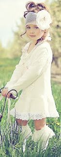
For this vintage-y lace-y thing, I took my main inspiration from two different photo inspiration challenges: Loves Rubberstamps and Stampalot. I'm not actually entering the Stampalot challenge, because I'm a bit late for it, but it seemed only fair to show the inspiration photo anyway.
Lace-flowers-vintage was the message I got from both photos.
Now, most of my inks are pigment inks. Last night I stamped myself a floral background on a white base, sometimes stamping twice without re-inking for a faded look. I was also determined to color-distress the edges. With pigment inks. And I don't actually have any brown inks that aren't really dark chocolate-y chestnut-y brown.
The closest I do have to light brown is the Amber Satin in my Silks 'n' Satins Colorbox Queue. It's sort of a metallic taupe. I know, distressing with a metallic pigment ink? It's not ideal. But I tried it and I think it worked out okay.
I did go out this morning and get some Tea Dye Distress ink. If that's what Tim Holtz thinks things dyed with tea looks like, he maybe ought try tea-dying again, because this is way too dark and way too red-orange. I mean, sure, I can dye things pink with tea, but that is because I drink herbal strawberry tea, which involves no actual tea leaves.
Actual black tea does not dye an orangeish color and it's usually not this dark. I wanted neither dark nor orange for this project -- although I did use it to color a bit of white ribbon, and that turned out to be a color I could use. I didn't like it for edging.
I think maybe dye inks just aren't for me? I guess I should give the Antique Linen and Old Paper colors a try before I completely give up on a product designed to do exactly what I'm trying to do with it. Sheesh, I'm glad I didn't try Vintage Photo, that stuff's even darker than Tea Dye. Am I using it wrong? Edging doesn't seem like a technique that's easy to mess up.
Where was I? Oh, yes, so then I tone-on-tone stamped a couple of small pieces of paper with the same flowers as the background -- you can't see it in the photo and can hardly see it in real life, but at least it adds some texture -- and edged them too. With Amber Silk. I stamped myself a little button, backed it on another piece of cardboard, pierced it, threaded the Tea Dye'd ribbon through and tied it in a bow. I couldn't make myself use a real button; it would be too hard to shut a book on it. As it is I have my doubts about the knot of the bow.
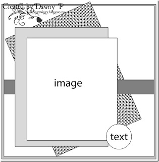
I used this week's sketch (#72) from Papertake Weekly, turning it on its side and doing away with one of the matting layers. My button isn't exactly text, but it's the right shape...
I had a sort of empty space left on the middle paper layer, so I punched a little flower using my corner punch, cut around it, and colored it with more of the red-purples from the Silks 'n' Satins queue. I don't know that it quite fits the rest of the bookmark, but it's a flower in the right colors, so close enough.
(It's not backed on black, that's just the photo background.)
I'm entering this bookmark in the following challenges:
I'm also linking it up to DL.ART's 1000-post Linky Party.
Supplies: (ribbon is Spool o' Ribbon white 1/8" by Offray, and lace is Celebrate It Occasions (i.e. Michaels) white 7/8")