Showing posts with label creativeinspirations. Show all posts

Wednesday, January 30, 2013

(The RNG at) Creative Inspirations Paints liked Cheery Cherry Snowman!

I've been not terribly active in the whole reading-blogs-and-posting business lately, so I've only just now seen that Cheery Cherry Snowman came out of the hat as a Top 3 entry in Creative Inspirations Paint's "Case It!" challenge.

Random or not, it's always a thrill to see something I made show up in a winners post!

Sunday, January 6, 2013

Bookmarks LIX: Cheery Cherry Snowman

I quite liked a couple of the thank-you cards I made -- so I repeated them as bookmarks. That way I can keep them as well as send them away! The first one I did was a copy of the red card with the snowman that I posted earlier today. Of course, I didn't keep the thank-you sentiment.

I started by stamping a sentiment that said "snow, snow, snow" across the bottom... unfortunately, I stamped it very badly. I wracked my brain trying to figure out how to fix it... and finally settled for the simplest fix of all. I cut off the bottom. Then I found a different snowy sentiment and used that instead, putting it pretty much where the "thank you" was on the original card. Take that, mistake!

Since the design of this bookmark is pretty much identical to the card that inspired it, it doesn't really seem fair to enter it in any of the same challenges. However, I am entering it into this one, for which it seems quite well-suited:

Supplies:

Wednesday, November 21, 2012

Turquoise Treetop

I am really terrible at writing and sending thank-you notes or cards. Witness: My birthday is in September. I have only just sent a thank-you card to my grandmother for her present! But I made the card, so maybe she will be charmed anyway?

I had the hardest time getting the image to really show up; the thin gold embossing just disappears at some angles. First I tried lightly rubbing some ink over the image -- you can see it if you look hard -- which helped a bit, but not enough. I brainstormed ideas with my boyfriend for a while, and finally decided to try coloring bits in. It's still not perfect but at least you can tell there's an image there!

I made a (slightly wonky) envelope too, but I was apparently not paying attention to focusing when I took pictures of it. Oh well, I'm sure you've all seen envelopes before!

I'm entering this belated card in the following challenges:

Supplies: (the "merci" stamp is from Lawn Fawn)

Tuesday, October 23, 2012

Bookmarks XLIV: Time Vines

No long meanderings from me today; my own clock is ticking towards deadlines rather faster than I would like.

I made this bookmark mainly for this week's challenge / 3rd anniversary celebration at The Play Date Cafe. The bit where their color scheme fit some of my paper scraps didn't really hurt either!

Of course, it also seemed appropriate to enter it in Creative Craft Challenges' 3rd Blogoversary "Three" challenge. I guess this is a good time of the year for 3rd anniversaries!

You'll notice I set the clock to 3:00; that's why I thought it was appropriate for both.

Someday I will remember to stamp intricate designs on not-intricate-designs paper. Oh well, it works well enough; at least the embossing powder is a different color than the backing paper.

I've photographed this bookmark against a page of The 13 Clocks, by James Thurber, which seemed fairly appropriate.

I'm entering this timey-viney bookmark into the following challenges:

Supplies:

Sunday, September 30, 2012

Bookmarks XXXV: Pressed Flowers

I'm really happy with the background I made for this bookmark, and I like it overall. But I'm pretty sure this vintage-y lace-y stuff is not my strength.

Partly because now I have to remember to hide the ribbon and lace ribbon from my cat, who loves to eat it. Not only is that bad for the ribbon, it's pretty bad for the cat.

For this vintage-y lace-y thing, I took my main inspiration from two different photo inspiration challenges: Loves Rubberstamps and Stampalot. I'm not actually entering the Stampalot challenge, because I'm a bit late for it, but it seemed only fair to show the inspiration photo anyway.

Loves Rubberstamps Pintrest Photo Inspiration Challenge Stampalot September Inspiration Challenge

Lace-flowers-vintage was the message I got from both photos.

Now, most of my inks are pigment inks. Last night I stamped myself a floral background on a white base, sometimes stamping twice without re-inking for a faded look. I was also determined to color-distress the edges. With pigment inks. And I don't actually have any brown inks that aren't really dark chocolate-y chestnut-y brown.

The closest I do have to light brown is the Amber Satin in my Silks 'n' Satins Colorbox Queue. It's sort of a metallic taupe. I know, distressing with a metallic pigment ink? It's not ideal. But I tried it and I think it worked out okay.

I did go out this morning and get some Tea Dye Distress ink. If that's what Tim Holtz thinks things dyed with tea looks like, he maybe ought try tea-dying again, because this is way too dark and way too red-orange. I mean, sure, I can dye things pink with tea, but that is because I drink herbal strawberry tea, which involves no actual tea leaves.

Actual black tea does not dye an orangeish color and it's usually not this dark. I wanted neither dark nor orange for this project -- although I did use it to color a bit of white ribbon, and that turned out to be a color I could use. I didn't like it for edging.

I think maybe dye inks just aren't for me? I guess I should give the Antique Linen and Old Paper colors a try before I completely give up on a product designed to do exactly what I'm trying to do with it. Sheesh, I'm glad I didn't try Vintage Photo, that stuff's even darker than Tea Dye. Am I using it wrong? Edging doesn't seem like a technique that's easy to mess up.

Where was I? Oh, yes, so then I tone-on-tone stamped a couple of small pieces of paper with the same flowers as the background -- you can't see it in the photo and can hardly see it in real life, but at least it adds some texture -- and edged them too. With Amber Silk. I stamped myself a little button, backed it on another piece of cardboard, pierced it, threaded the Tea Dye'd ribbon through and tied it in a bow. I couldn't make myself use a real button; it would be too hard to shut a book on it. As it is I have my doubts about the knot of the bow.

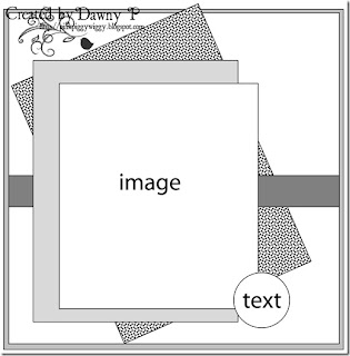
I used this week's sketch (#72) from Papertake Weekly, turning it on its side and doing away with one of the matting layers. My button isn't exactly text, but it's the right shape...

Papertake Weekly Sketch #72

I had a sort of empty space left on the middle paper layer, so I punched a little flower using my corner punch, cut around it, and colored it with more of the red-purples from the Silks 'n' Satins queue. I don't know that it quite fits the rest of the bookmark, but it's a flower in the right colors, so close enough.

(It's not backed on black, that's just the photo background.)

I'm entering this bookmark in the following challenges:

I'm also linking it up to DL.ART's 1000-post Linky Party.

Supplies: (ribbon is Spool o' Ribbon white 1/8" by Offray, and lace is Celebrate It Occasions (i.e. Michaels) white 7/8")

Wednesday, September 26, 2012

Bookmarks XXXI: Scare Up Some Fun

I have to admit Lawnscaping challenges are a bit frustrating for me. Because gosh darn it, I want to enter more than three challenges with one project! So many Anything Goes challenges are deprived of the fruit of my genius efforts! (I'm sure they're heartbroken.)

But I love Lawn Fawn and I love the aesthetic sense of the whole Lawnscaping design team, and I can't let it go by without an entry. And it does make writing up the challenge listing a lot easier, so there's that.

This week's challenge was to add text -- use a sentiment or patterned paper. So I used both.

For my patterned paper I used one with a bunch of stereotypical cat names on it. This paper has a bit of a distressed look -- so the solid cardstock colors I used looked a little too, well, solid. Since the colorful kitty names are mostly streaked with red on the patterned paper, I smushed my finger into a red ink pad and rubbed it on. They ended up with a similar streaky look, just as I was hoping! (I didn't rub it on the whole of the greenish base, but used my mostly-dried finger to add just a little to the area around the sentiment.)

I only own one set of Lawn Fawn stamps (although another should be in the mail soon!), and no Wags 'n Whiskers stamps, and no Creative Inspirations paint, so I hope the design teams are not too saddened when they see absolutely none of those things on my bookmark.

I'm entering this bookmark in the following challenges:

I'm also linking it up to DL.ART's 1000-post Linky Party and Unique Crafters' Big Chance Giveaway.

Supplies:

Monday, September 17, 2012

Bookmarks XXIII: Thing That Goes Bump In The Night

From ghoulies and ghosties
And long-leggedy beasties
And things that go bump in the night,
Good Lord, deliver us!

I didn't just use the "Mustard, Navy, and Orange" color prompt from this week's Stampotique challenge -- I actually took a look at the design team's designs. Wouldn't you know it, those pieces they make for inspiration are inspiring!

In this case, I had no idea what to do with mustard, navy, and orange. I guess it's a great combination for some moldy bread? Presenting Bookmarks #23: Penicillin! But I took inspiration from the trend I saw in the images used by the design team: a little bit odd, a little bit monstrous, and a little bit sketchy.

I hadn't opened it yet, but I did have a stamp set that fit those criteria: the Little Monsters cling rubber set from Recollections (a.k.a. Michaels). It even has a little boo! sentiment, so I decided to make a Halloween-y bookmark.

It's a fairly cute little monster-thing. I first stamped it in mustard and clear-embossed it, but it was pretty hard to see against the orange background. So I took some blue and some black (I don't actually have any navy) ink and smudged them around with my fingers. Fortunately this worked; the heights of the embossed monster caught more color than the underlying cardstock, and now the monster shows up acceptably. I repeated this technique -- stamping in Perfect Medium and clear embossing -- to make a strip of tone-on-tone boo! sentiments. I also then repeated the "oops, smudge ink on it" technique when I realized I wanted something that stood out more than tone-on-tone. An extra benefit of the embossing is that the words are shiny, so they stand out well when you take a picture with the flash on -- as you may have noticed.

This bookmark is also a fairly successful example of using a wide sketch to make a skinny bookmark. I used this week's Sketch Saturday sketch (#225) and turned it on its side, which is my go-to first attempt at using sketches.

I interpreted the skinny strip pretty faithfully. For the wide strip, I stamped the boo! sentiment all the way down the side of the card -- so it is both the strip and the sentiment. I took the liberty of placing the focal element at a bit of an angle, because with this much smudging and fraying going on it felt better that way than straight and square.

I'm entering this bookmark in the following challenges:

I'm also linking it up to DL.ART's 1000-post Linky Party.

Supplies: